Everything1 you need2 to know about linear modelling3
1 A lot of the things 2 You should probably know 3 About some standard types of linear models (incluing LMs, LMMs, and GLMMs)
Overview
If you ever have to analyze data, chances are you’ll need to run some variation of a linear model. In fact, most of the basic tests you might have learn how to run in early statistics courses are just linear models with some extra assumptions thrown in! If you develop a solid understanding of what linear models really are, you’ll never actually have to run a t-test or ANOVA again. And more importantly, you’ll be able to interpret your results properly and explain them with more ease.
In this tutorial, we’re going to go over some basic concepts behind what linear modelling actually is (in all of it’s many beautiful forms!) and provide some (hopefully) helpful code to set up the basis for your own modelling workflow. We’ll go through the major steps of building, checking, interpreting, and visualizing models:
- Interpreting model outputs
- Plotting model outputs
- Standardizing continuous variables
- Checking for multicollinearity
- Checking model residuals
- Choosing a distribution
- Extracting model predictions
- Conducting post hoc pairwise comparisons
We’ll get started by loading in the packages we need as well as the data we’ll be using throughout this tutorial. We’re going to be using the palmerpenguins dataset throughout this tutorial, but we’re going to simulate a little bit of our own data for this dataset as well, so we can look at how different data types get modelled differently.
library(tidyverse) #for general data wrangling and plotting
library(palmerpenguins) #for the example dataset
library(emmeans) #for post hoc comparisons
library(performance) #for variance inflation factors
library(DHARMa) #for residual checks
library(glmmTMB) #for running models
library(ggeffects) #for extracting predictions and running post hoc tests
library(mgcv) #for generating random Tweedie distribution
set.seed(12345)
#let's use the penguins dataset from palmerpenguins
df <- penguins %>%
  #remove any rows that have NAs for the variables we care about
  filter(!is.na(sex)) %>%
  #and create a new column for each variable with standardized values
  #this subtracts the mean from each value and divides by the standard deviation
  #of the data to put all of our variables on the same unitless scale
  #note that I used c() on each scale() function to remove the extra attributes
  #that the scale() function creates which cause issues with other packages
  mutate(bill_length_stand = c(scale(bill_length_mm)),
         bill_depth_stand = c(scale(bill_depth_mm)),
         flipper_length_stand = c(scale(flipper_length_mm)),
         body_mass_stand = c(scale(body_mass_g)),
         #create a count variable so we can run a negative binomial model later
         no_mites = rnbinom(nrow(.),
                            mu = .$body_mass_g/100, size = 5),
         #and make some extra islands - this is janky as hell but i'm tired,
         #don't @ me
         isls = as.numeric(c(rep(seq(from = 1, to = 6, by = 1), times = 55),
                             1, 2, 3)),
         island = as.character(island),
         island = case_when(isls == 4 ~ "Hannah",
                            isls == 5 ~ "Helen",
                            isls == 6 ~ "Hanelen",
                            TRUE ~ island),
         species = factor(species, levels = c("Chinstrap", "Adelie", "Gentoo"))) %>%
  select(-isls)
head(df)
## # A tibble: 6 x 13
##   species island bill_length_mm bill_depth_mm flipper_length_~ body_mass_g sex
##   <fct>   <chr>           <dbl>         <dbl>            <int>       <int> <fct>
## 1 Adelie  Torge~           39.1          18.7              181        3750 male
## 2 Adelie  Torge~           39.5          17.4              186        3800 fema~
## 3 Adelie  Torge~           40.3          18                195        3250 fema~
## 4 Adelie  Hannah           36.7          19.3              193        3450 fema~
## 5 Adelie  Helen            39.3          20.6              190        3650 male
## 6 Adelie  Hanel~           38.9          17.8              181        3625 fema~
## # ... with 6 more variables: year <int>, bill_length_stand <dbl>,
## #   bill_depth_stand <dbl>, flipper_length_stand <dbl>, body_mass_stand <dbl>,
## #   no_mites <dbl>
Each row in the dataset is a single penguin, and we have information about each individual’s species and sex, what island they were found on, and a few different measures of body size (like bill length/depth, flipper length, and body mass), as well as which year they were observed. We also made up a variable to represent the number of parasitic mites on each penguin. Finally, we made a new column for the standardized version of each continuous variable - we’ll get into why we did that (and why you often should!) a little later on.
Basic linear models
All linear models are just some variation of the classic equation y = mx + b!
When we want to determine the relationship between two (or more) variables, we can always come back to that trusty old equation from high school. If high school is a blur, all you need to remember is that the equation y = mx + b can be used to describe any straight line. To find any value of y, you multiply a given x value by m, and add b.
In the context of linear modelling, we are trying to determine what line best represents the relationship between our variables of interest. So we are estimating some intercept (b), which is the expected response when all of our predictors (x) are set to 0, and one or more slopes (m) that represent the strength of the effect of each of our predictors (x).
Continuous predictors
This is the most clear when we look at a simple linear model with one continuous predictor. Let’s say we are interested in determining how penguins’ bill depths are related to their bill lengths:
mod_cont <- lm(bill_length_mm ~ bill_depth_mm, data = df)
summary(mod_cont)
##
## Call:
## lm(formula = bill_length_mm ~ bill_depth_mm, data = df)
##
## Residuals:
##      Min       1Q   Median       3Q      Max
## -12.9498  -3.9530  -0.3657   3.7327  15.5025
##
## Coefficients:
##               Estimate Std. Error t value Pr(>|t|)
## (Intercept)    54.8909     2.5673  21.380  < 2e-16 ***
## bill_depth_mm  -0.6349     0.1486  -4.273 2.53e-05 ***
## ---
## Signif. codes:  0 '***' 0.001 '**' 0.01 '*' 0.05 '.' 0.1 ' ' 1
##
## Residual standard error: 5.332 on 331 degrees of freedom
## Multiple R-squared:  0.05227,    Adjusted R-squared:  0.04941
## F-statistic: 18.26 on 1 and 331 DF,  p-value: 2.528e-05
Let’s take a closer look at what this type of output means.
While it’s nice to be able to quickly look at a model summary to understand what’s going on, plotting the model directly onto the raw data is usually the easiest way to get a clearer picture of things.
#plot the relationship
ggplot(df, aes(x = bill_depth_mm, y = bill_length_mm)) +
  geom_point() +
  stat_smooth(method = 'lm', fullrange = TRUE) +
  theme_classic()
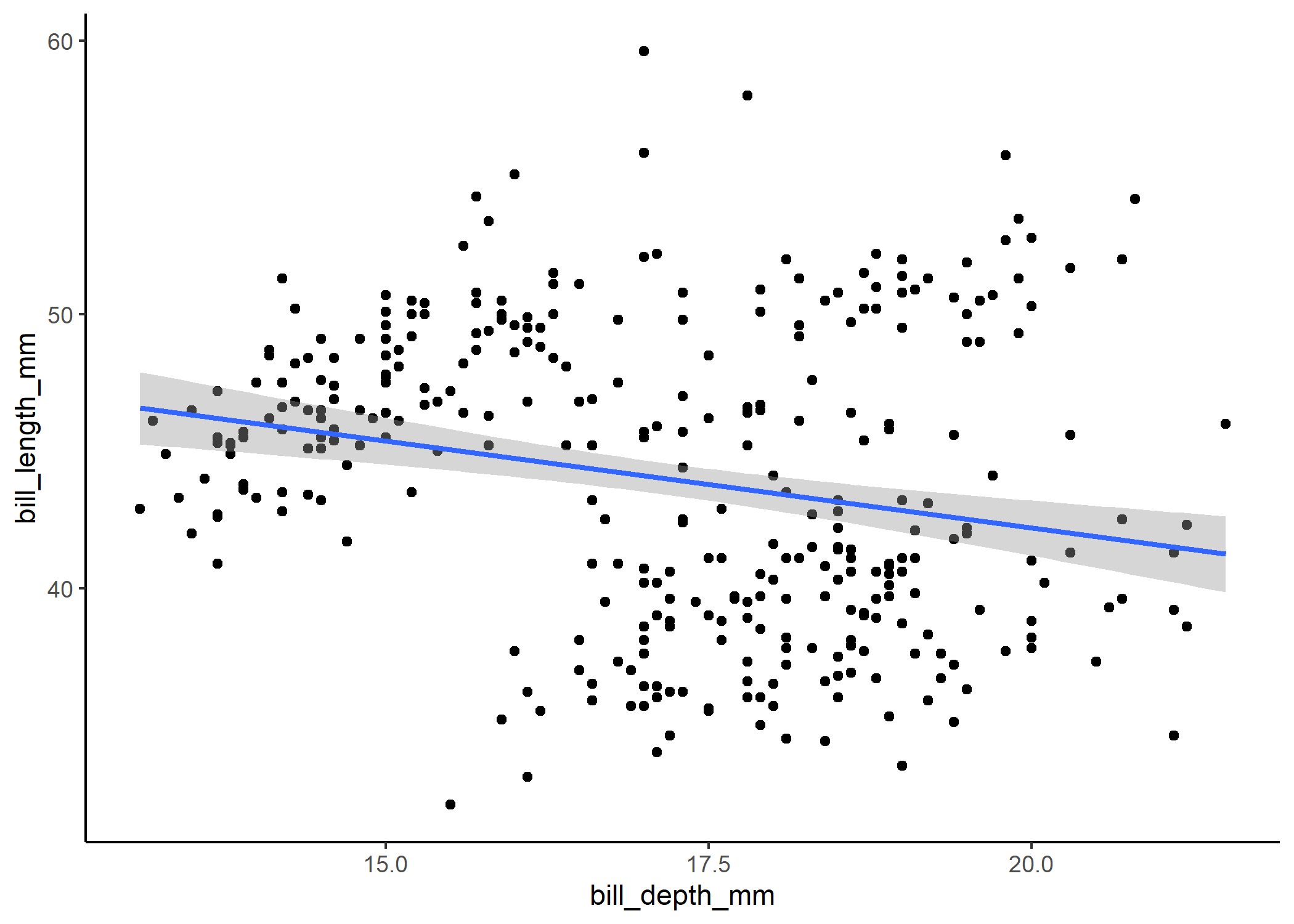
To see exactly how the plot relates to the model coefficients, we can extend the x-axis to 0 (i.e., the intercept position).
#now show how it relates to the coefficient estimates
ggplot(df, aes(x = bill_depth_mm, y = bill_length_mm)) +
  geom_point() +
  stat_smooth(method = 'lm', fullrange = TRUE) +
  theme_classic() +
  xlim(0,NA) +
  geom_vline(xintercept = 0)
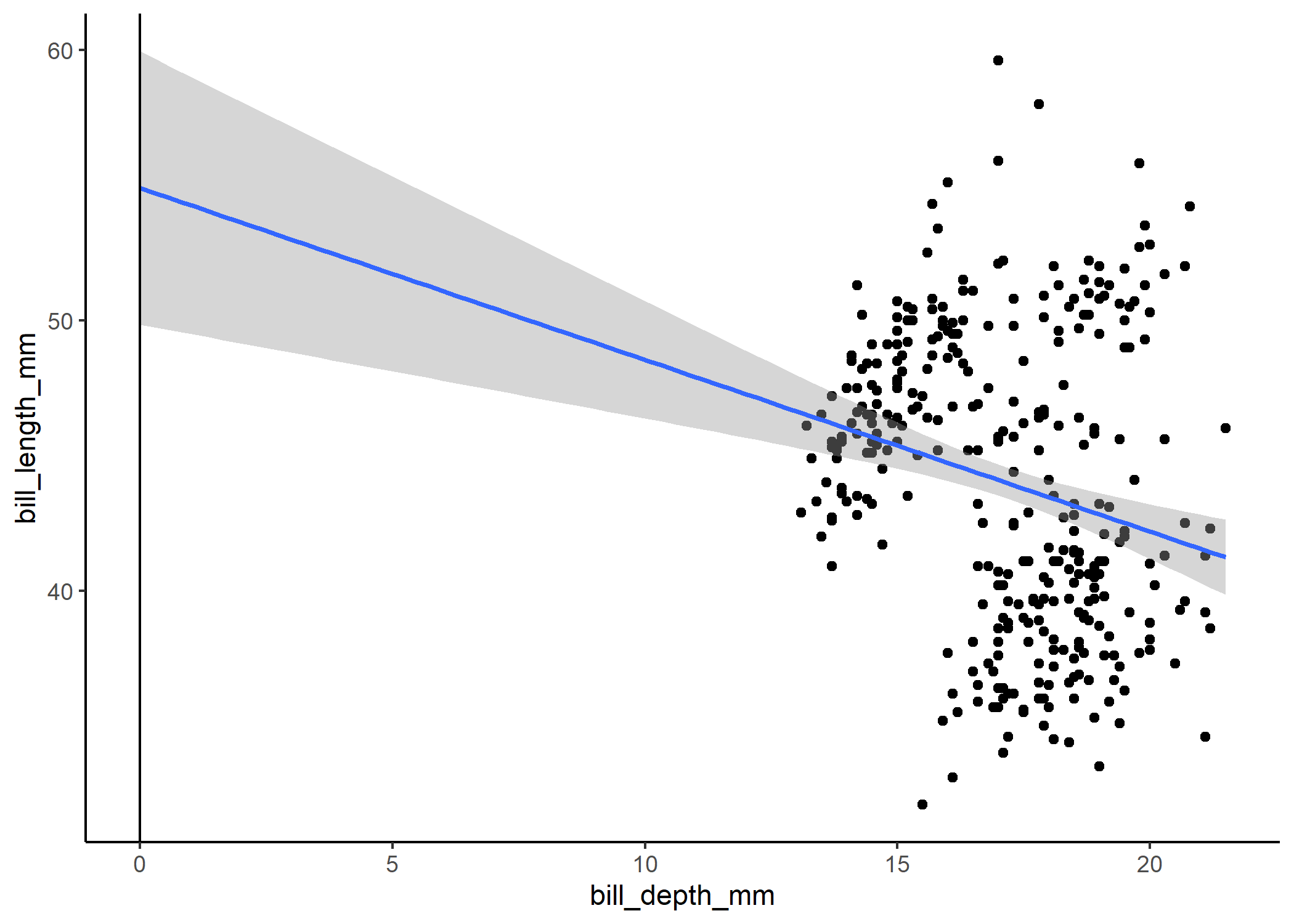
Standardizing your predictors
The problem with this is that our intercept tells us that we expect bill length to be about 55 mm when bill depth is 0 mm, but we know that’s not likely the case - it’s just the consequence of us extrapolating way beyond the range of our data. One useful trick for dealing with this is to standardize (i.e., center and scale) our variables. We did this when we first loaded the data using the scale() function. For each variable, we subtract the mean from each observation and divide it by the standard deviation. This means that the new mean across all the observations is 0, the SD is now 1, and the observations are unitless.
Note: do NOT standardize the response variable
This will change the coefficient estimates in the model output, but we can then backtransform them into real units again.
mod_cont_stand <- lm(bill_length_mm ~ bill_depth_stand, data = df)
summary(mod_cont_stand)
##
## Call:
## lm(formula = bill_length_mm ~ bill_depth_stand, data = df)
##
## Residuals:
##      Min       1Q   Median       3Q      Max
## -12.9498  -3.9530  -0.3657   3.7327  15.5025
##
## Coefficients:
##                  Estimate Std. Error t value Pr(>|t|)
## (Intercept)       43.9928     0.2922 150.565  < 2e-16 ***
## bill_depth_stand  -1.2503     0.2926  -4.273 2.53e-05 ***
## ---
## Signif. codes:  0 '***' 0.001 '**' 0.01 '*' 0.05 '.' 0.1 ' ' 1
##
## Residual standard error: 5.332 on 331 degrees of freedom
## Multiple R-squared:  0.05227,    Adjusted R-squared:  0.04941
## F-statistic: 18.26 on 1 and 331 DF,  p-value: 2.528e-05
Now the intercept makes more sense - when a penguin has the mean value for bill depth, we expect its bill length to be 44 mm. The coefficient estimate for bill depth no longer refers to the effect you expect to see per mm, but rather for each SD increase in bill depth. For more info on interpreting intercept terms in different contexts, check out our interactions tutorial.
Multicollinearity
One important thing to note is that if you have more than one predictor
in your model, you need to make sure they are not too correlated with
one another - if they are, then the model doesn’t know how to partition
the effect sizes between them and you’ll likely underestimate their
effects. To do this, you can run the model and then use the car
package to check the variance inflation factors (VIFs) of the
predictors. Different people have different thresholds for what counts
as “acceptable” values for VIFs, but we typically use 2. Say we also
wanted to look at how flipper length and body mass were related to bill
length:
mod_co <- lm(bill_length_mm ~ body_mass_g + bill_depth_mm + flipper_length_mm,
             data = df)
car::vif(mod_co)
##       body_mass_g     bill_depth_mm flipper_length_mm
##          4.231308          1.511148          4.936643
This would be concerning! Body mass and flipper length both have relatively high VIFs, meaning a lot of the variation in bill length that they each describe is already explained by other variables in the model. We’ll get into what to do about high VIFs a little later.
Categorical predictors
Linear models with categorical variables work in a similar way to continuous ones. Let’s say we were interested in seeing how bill lengths differ between male and female penguins. We could run a t-test, but it’s really just another way of running this linear model:
mod_cat <- lm(bill_length_mm ~ sex, data = df)
summary(mod_cat)
##
## Call:
## lm(formula = bill_length_mm ~ sex, data = df)
##
## Residuals:
##      Min       1Q   Median       3Q      Max
## -11.2548  -4.7548   0.8452   4.3030  15.9030
##
## Coefficients:
##             Estimate Std. Error t value Pr(>|t|)
## (Intercept)  42.0970     0.4003 105.152  < 2e-16 ***
## sexmale       3.7578     0.5636   6.667 1.09e-10 ***
## ---
## Signif. codes:  0 '***' 0.001 '**' 0.01 '*' 0.05 '.' 0.1 ' ' 1
##
## Residual standard error: 5.143 on 331 degrees of freedom
## Multiple R-squared:  0.1184, Adjusted R-squared:  0.1157
## F-statistic: 44.45 on 1 and 331 DF,  p-value: 1.094e-10
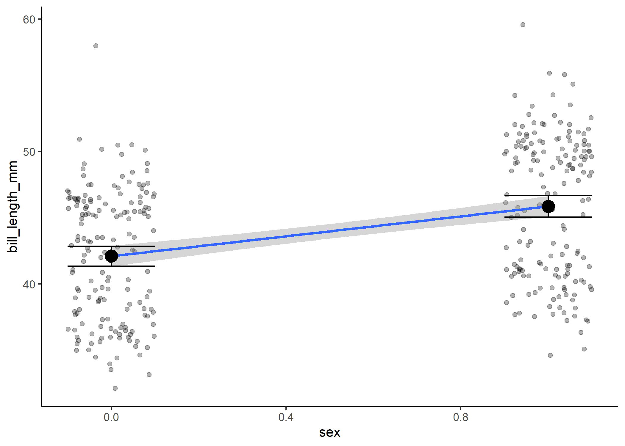
And we can plot our data with the means and uncertainty around them:
#plot the relationship
ggplot(df, aes(x = sex, y = bill_length_mm)) +
  geom_jitter(width = 0.2, alpha = 0.3) +
  theme_classic() +
  stat_summary(fun = mean, size = 1) +
  stat_summary(fun.data = mean_cl_normal, geom = "errorbar", width = 0.2)
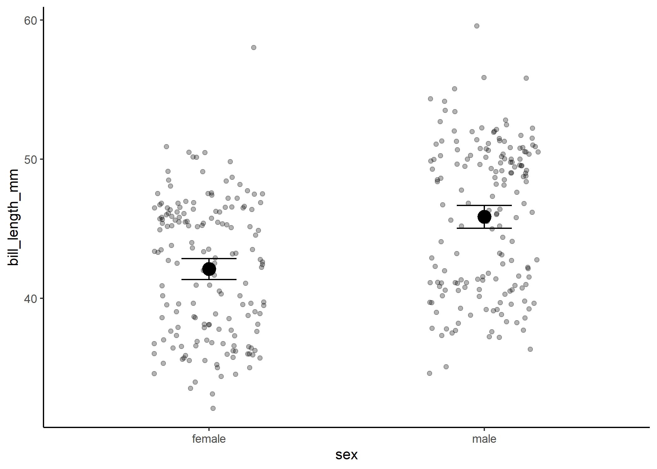
However, what’s actually going on under the hood is that we’re still estimating a slope and intercept! In this case, we treat one of our categories as a 0 and the other as a 1, and we estimate the slope of the line between them.
#now show how it relates to the coefficient estimates
df %>%
  mutate(sex = as.numeric(sex) - 1) %>%
  ggplot(aes(x = sex, y = bill_length_mm)) +
    geom_jitter(width = 0.1, alpha = 0.3) +
    stat_smooth(method = 'lm', fullrange = TRUE) +
    theme_classic() +
    stat_summary(fun = mean, size = 1) +
    stat_summary(fun.data = mean_cl_normal, geom = "errorbar", width = 0.2)
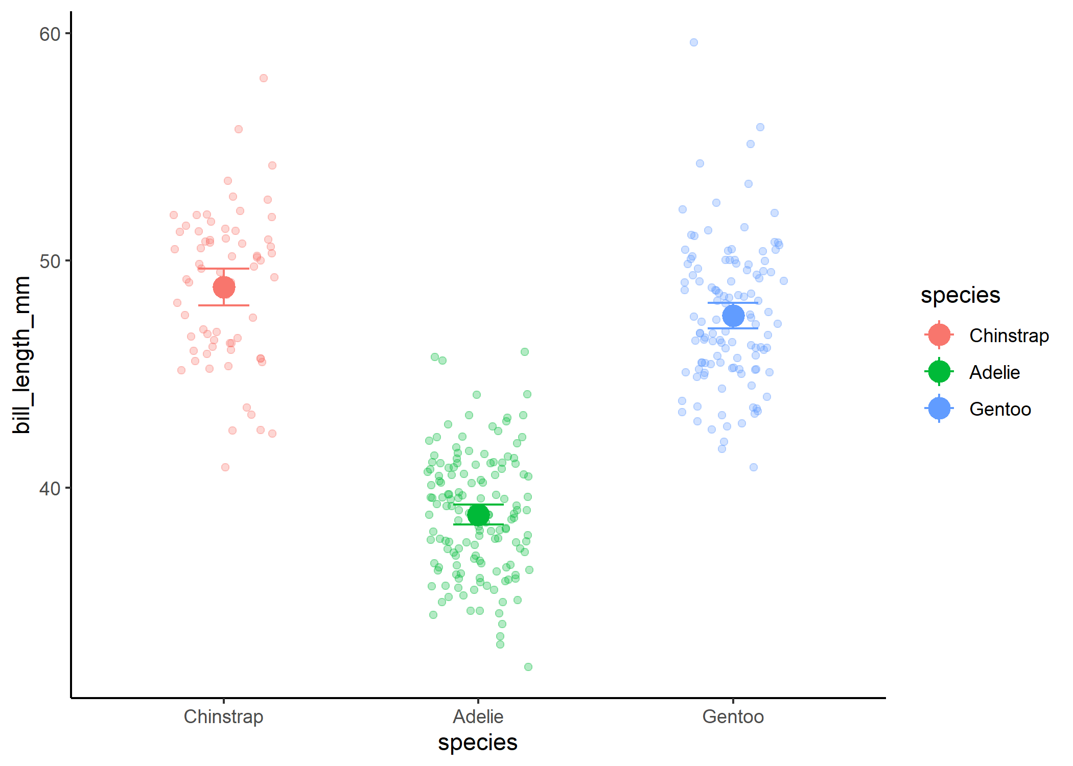
Where things can get confusing with this is when you have more than two levels.
mod_three <- lm(bill_length_mm ~ species, data = df)
summary(mod_three)
##
## Call:
## lm(formula = bill_length_mm ~ species, data = df)
##
## Residuals:
##    Min     1Q Median     3Q    Max
## -7.934 -2.234  0.076  2.066 12.032
##
## Coefficients:
##               Estimate Std. Error t value Pr(>|t|)
## (Intercept)    48.8338     0.3603 135.526  < 2e-16 ***
## speciesAdelie -10.0099     0.4362 -22.946  < 2e-16 ***
## speciesGentoo  -1.2658     0.4517  -2.802  0.00537 **
## ---
## Signif. codes:  0 '***' 0.001 '**' 0.01 '*' 0.05 '.' 0.1 ' ' 1
##
## Residual standard error: 2.971 on 330 degrees of freedom
## Multiple R-squared:  0.7066, Adjusted R-squared:  0.7048
## F-statistic: 397.3 on 2 and 330 DF,  p-value: < 2.2e-16
#plot the relationship
df %>%
  ggplot(aes(x = species, y = bill_length_mm, colour = species)) +
    geom_jitter(width = 0.2, alpha = 0.3) +
    theme_classic() +
    stat_summary(fun = mean, size = 1) +
    stat_summary(fun.data = mean_cl_normal, geom = "errorbar", width = 0.2)
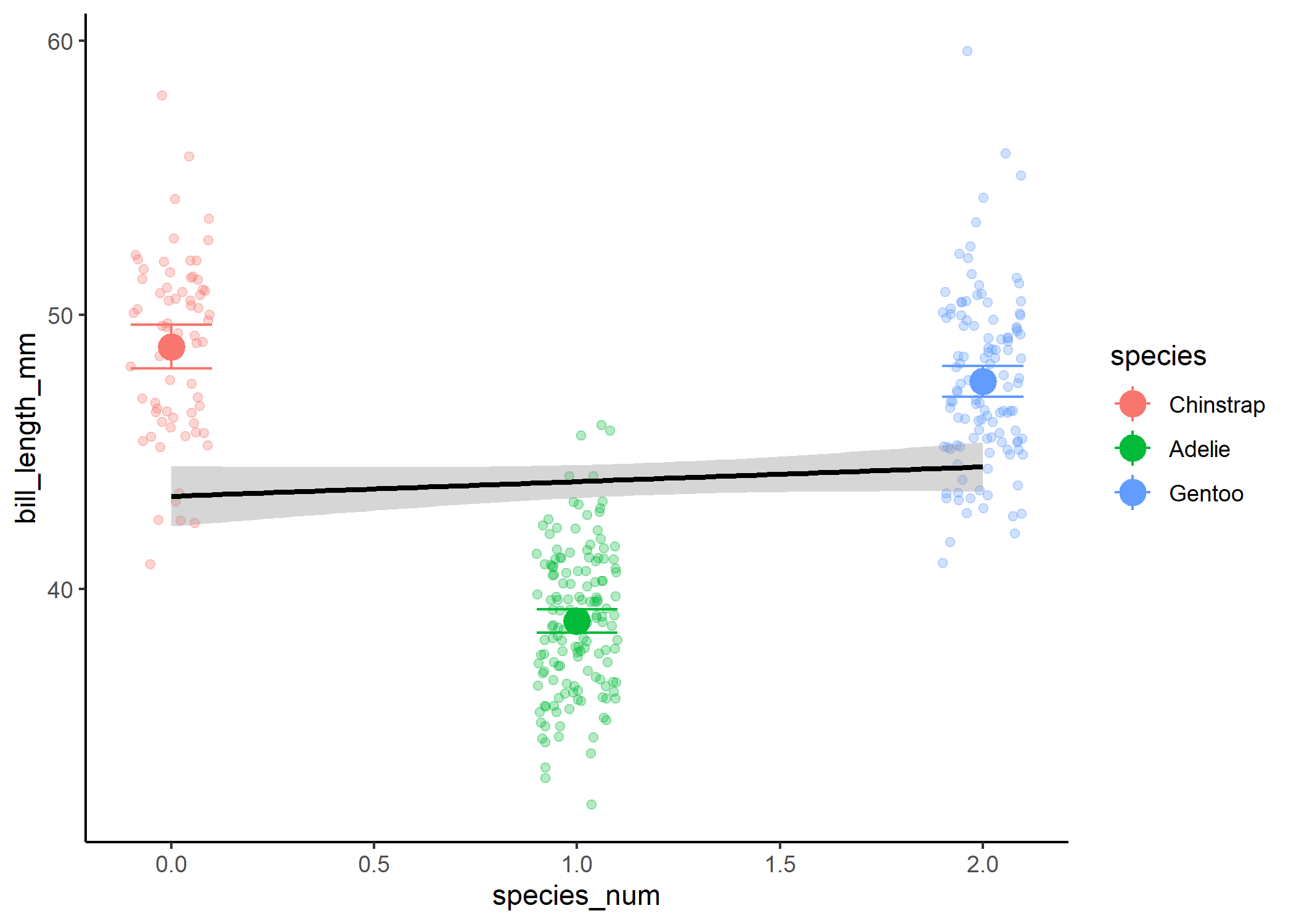
If we then treated the third level as a 2, we wouldn’t be able to actually look at differences between the groups:
#now show how it would relate to the coefficient estimates if we didn't dummy
#code
df %>%
  mutate(species_num = as.numeric(species)
         - 1) %>%
  ggplot(aes(x = species_num, y = bill_length_mm)) +
    geom_jitter(width = 0.1, alpha = 0.3, aes(colour = species)) +
    stat_smooth(method = 'lm', fullrange = TRUE, col = "black") +
    theme_classic() +
    stat_summary(fun = mean, size = 1, aes(colour = species)) +
    stat_summary(fun.data = mean_cl_normal, geom = "errorbar", width = 0.2,
                 aes(colour = species))
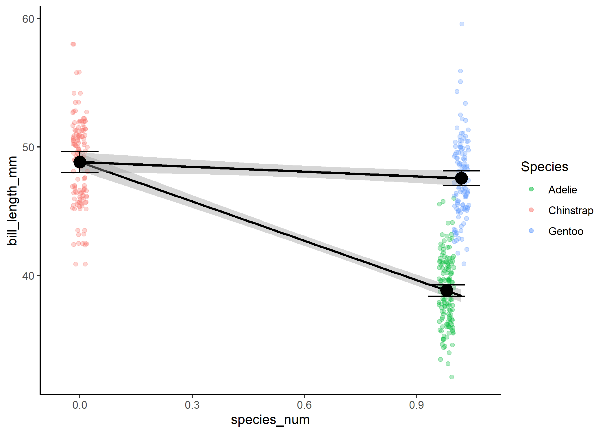
Instead, we’re going to create a second variable, where we treat our third level as a 1 and only compare it to the 0 level.
ggplot(df1, aes(x = species_num, y = bill_length_mm)) +
  geom_jitter(width = 0.02, alpha = 0.3,
              aes(colour = species)) +
  stat_smooth(method = 'lm', fullrange = TRUE, col = "black") +
  theme_classic() +
  stat_summary(fun = mean, size = 1) +
  stat_summary(fun.data = mean_cl_normal, geom = "errorbar", width = 0.1) +
  geom_jitter(data = df2, width = 0.02, alpha = 0.3, aes(colour = species)) +
  stat_smooth(data = df2, method = 'lm', fullrange = TRUE, col = "black") +
  stat_summary(data = df2, fun = mean, size = 1) +
  stat_summary(data = df2, fun.data = mean_cl_normal,
               geom = "errorbar", width = 0.1) +
  scale_colour_manual(name = "Species",
                      values = c("#00BA38", "#F8766D", "#619CFF"))
To actually compare all levels to each other rather than to our “0”
level, we need to run a post-hoc test that accounts for multiple
comparisons (i.e., the issue that the more comparisons you run, the
greater the chance you will observe a significant effect just by chance
alone). The package emmeans is a fantastic way to do this quickly:
emmean <- emmeans(mod_three, pairwise ~ species)
emmean$contrast
##  contrast           estimate    SE  df t.ratio p.value
##  Chinstrap - Adelie    10.01 0.436 330  22.946  <.0001
##  Chinstrap - Gentoo     1.27 0.452 330   2.802  0.0148
##  Adelie - Gentoo       -8.74 0.367 330 -23.828  <.0001
##
## P value adjustment: tukey method for comparing a family of 3 estimates
The emmeans “contrast” output shows you each combination of levels,
what the estimated difference in the response is for the two, and
whether this difference is significant or not.
Interaction terms
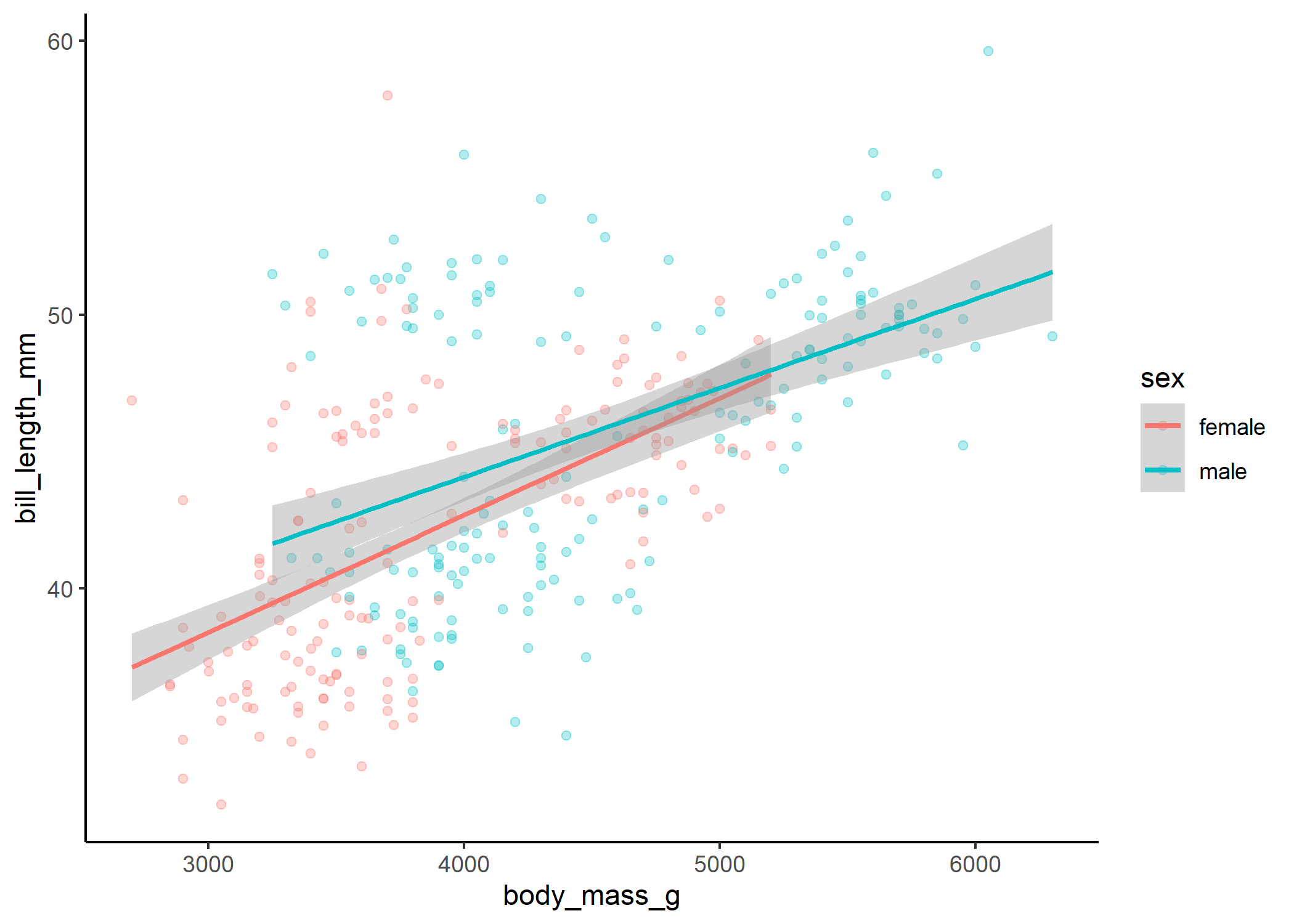
The only other key ingredient in basic linear models that we need to know about is the interaction. We use interactions when we think that the effect of one variable may differ depending on the value of another variable. For instance, we might think that the relationship between body mass and bill length could be different for male and female penguins.
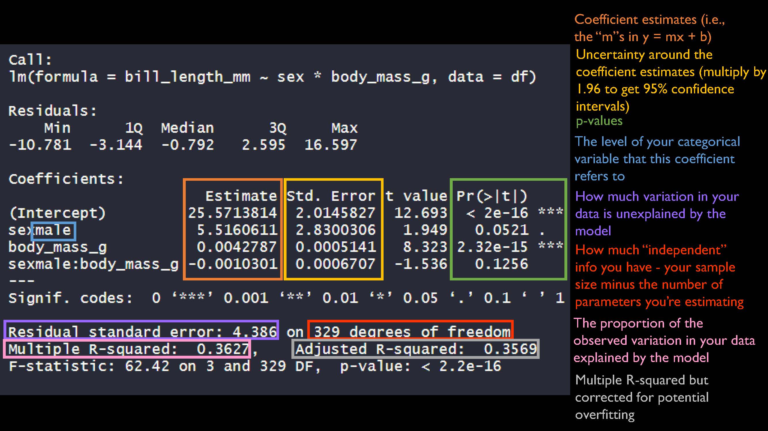
mod_int <- lm(bill_length_mm ~ sex * body_mass_g, data = df)
summary(mod_int)
##
## Call:
## lm(formula = bill_length_mm ~ sex * body_mass_g, data = df)
##
## Residuals:
##     Min      1Q  Median      3Q     Max
## -10.781  -3.144  -0.792   2.595  16.597
##
## Coefficients:
##                       Estimate Std. Error t value Pr(>|t|)
## (Intercept)         25.5713814  2.0145827  12.693  < 2e-16 ***
## sexmale              5.5160611  2.8300306   1.949   0.0521 .
## body_mass_g          0.0042787  0.0005141   8.323 2.32e-15 ***
## sexmale:body_mass_g -0.0010301  0.0006707  -1.536   0.1256
## ---
## Signif. codes:  0 '***' 0.001 '**' 0.01 '*' 0.05 '.' 0.1 ' ' 1
##
## Residual standard error: 4.386 on 329 degrees of freedom
## Multiple R-squared:  0.3627, Adjusted R-squared:  0.3569
## F-statistic: 62.42 on 3 and 329 DF,  p-value: < 2.2e-16
Our coefficient estimates are still a variation of y = mx + b! We get into it more in our interactions tutorial so we won’t repeat ourselves too much here.
The important thing is that we can visualize the results, even if the math isn’t super intuitive:
#plot the relationship
ggplot(df, aes(x = body_mass_g, y = bill_length_mm, colour = sex, group = sex)) +
  geom_jitter(width = 0.2, alpha = 0.3) +
  theme_classic() +
  stat_smooth(method = "lm")
#now show how it relates to the coefficient estimates
ggplot(df, aes(x = body_mass_g, y = bill_length_mm, colour = sex, group = sex)) +
  geom_jitter(width = 0.2, alpha = 0.3) +
  theme_classic() +
  stat_smooth(method = "lm", fullrange = TRUE) +
  xlim(0,NA) +
  geom_vline(xintercept = 0)
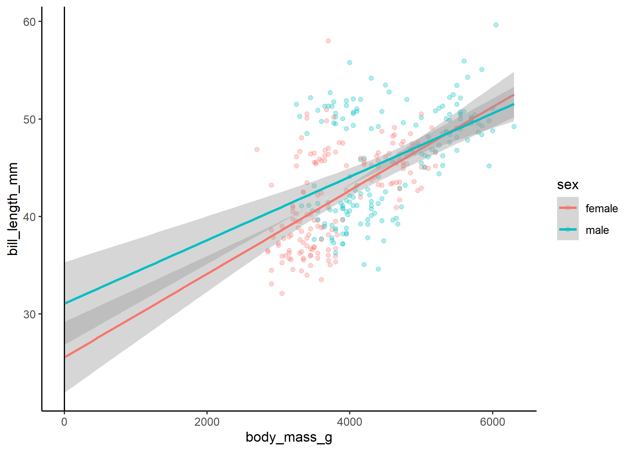
Here we can see that even though our interaction term isn’t quite significant, there is a slight difference in the slope of the relationship between body mass and bill length for males and females.
Checking model fit
Now, all of these models have run without any errors and have significant results, but does that mean that they’re any good? One important thing we need to do to evaluate this is to look at the residuals of the model. Essentially, for every data point, we take the observed value and subtract the expected outcome under the model. If our model is a good fit, the residuals should follow the distribution we specified in our model, and we shouldn’t see any patterns or clumping. There are lots of ways to check residuals (you can use plot(model) or the performance package), but we’re going to use DHARMa today, since it’s super flexible and works with virtually every type of GLMM.
Let’s start off by simulating the standardized residuals from our original model, with a single continuous predictor.
mod_cont_resids <- simulateResiduals(mod_cont)
plot(mod_cont_resids)
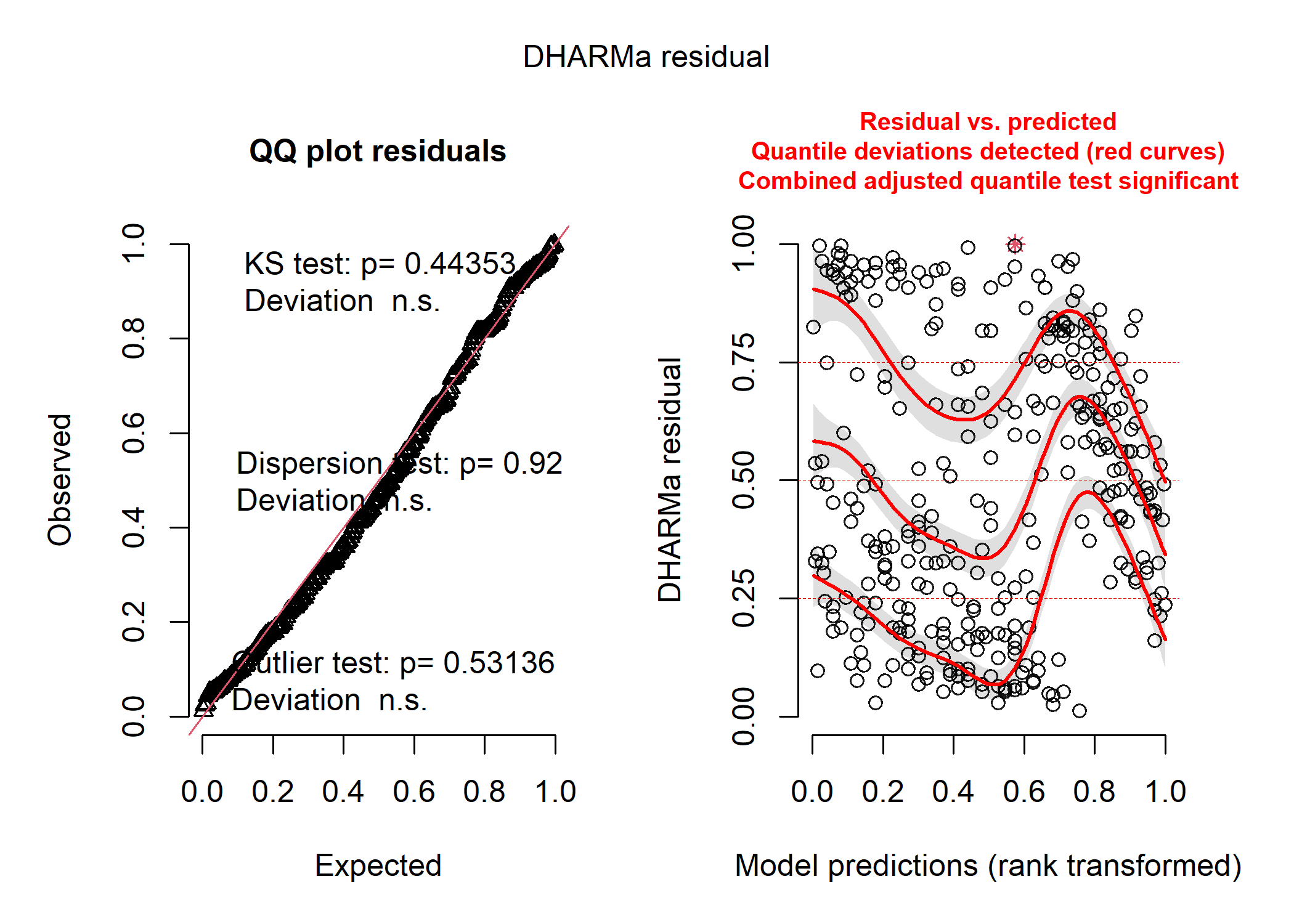
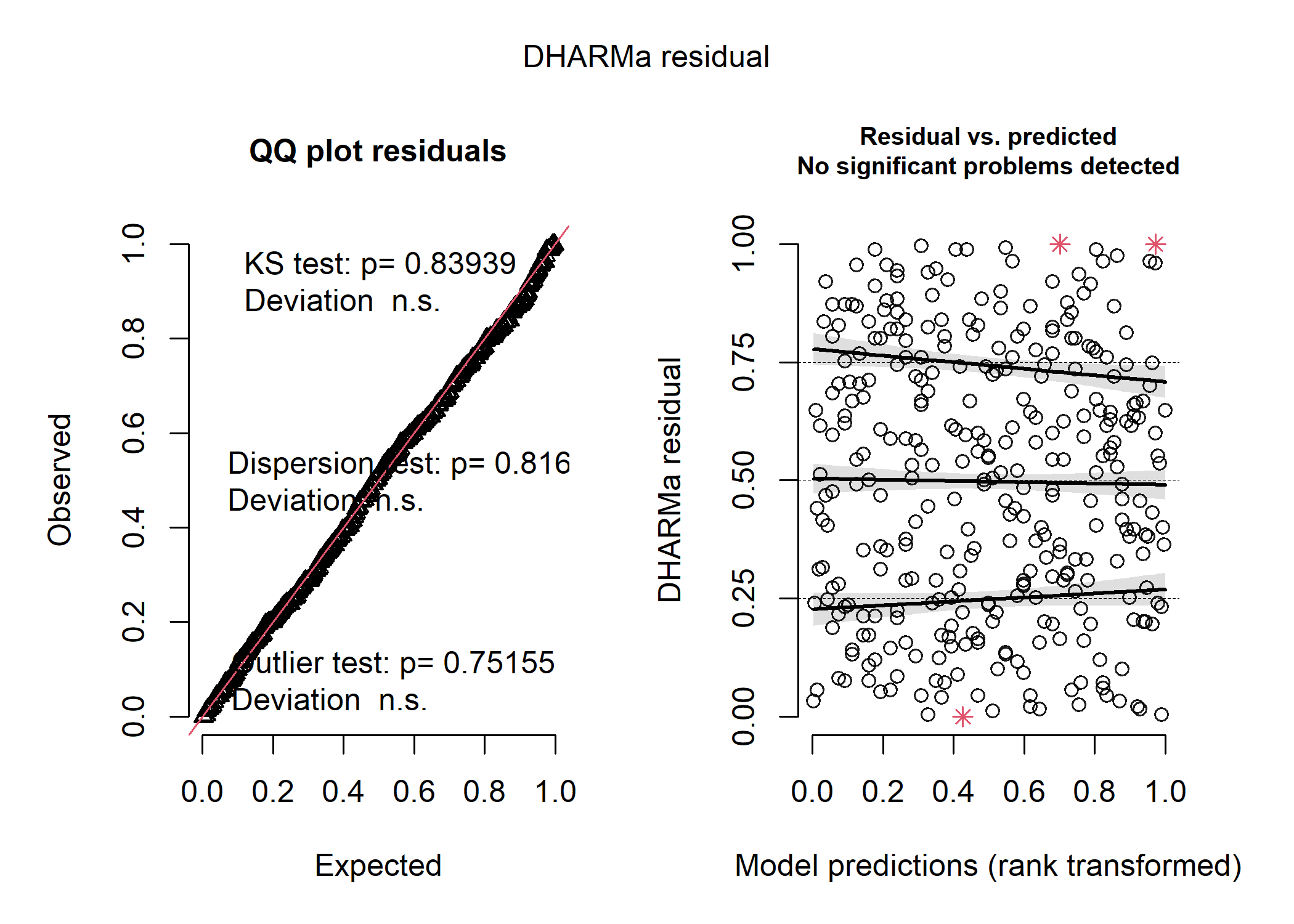
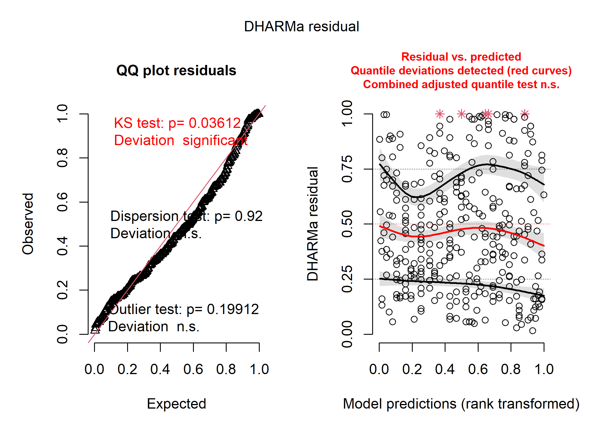
DHARMa creates two plots for us and runs three different tests that can help us figure out what (if anything) is wrong with our model. On the left panel, we see a qqplot of the standardized residuals - these should fall roughly along the straight line in a model that fits reasonably well. There are also the results of the three tests printed directly onto the panel - these will turn red if your model fails them! The KS test tells you if you’ve picked a reasonable distribution for your data (see the distributions section below for more details about that), the dispersion test tells you if your data are more or less dispersed than expected for your model (which can also give you a clue as to whether you’ve chosen the right distribution), and the outlier test tells you if any of your observations are statistical outliers that may be having a disproportionate influence on your model. On the right panel, we see a plot of our standardized residuals against the standardized model predictions - this helps us see if there is any weird patterning in our residuals and to look for issues like heteroskedasticity (i.e., if the amount of spread of our data around the modelled line increases with certain values of our predictor).
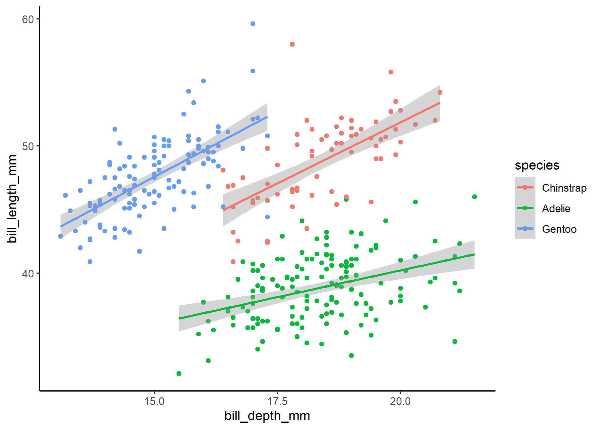
In our case, the plot on the left tells us that the distribution we chose (i.e., normal) probably was a reasonable choice and that our data aren’t over or underdispersed compared to what we’d expect under a normal distrbution, but the plot on the right tells us that something is really up. We can pull up our plot of the model fit on the raw data to see that issue too:
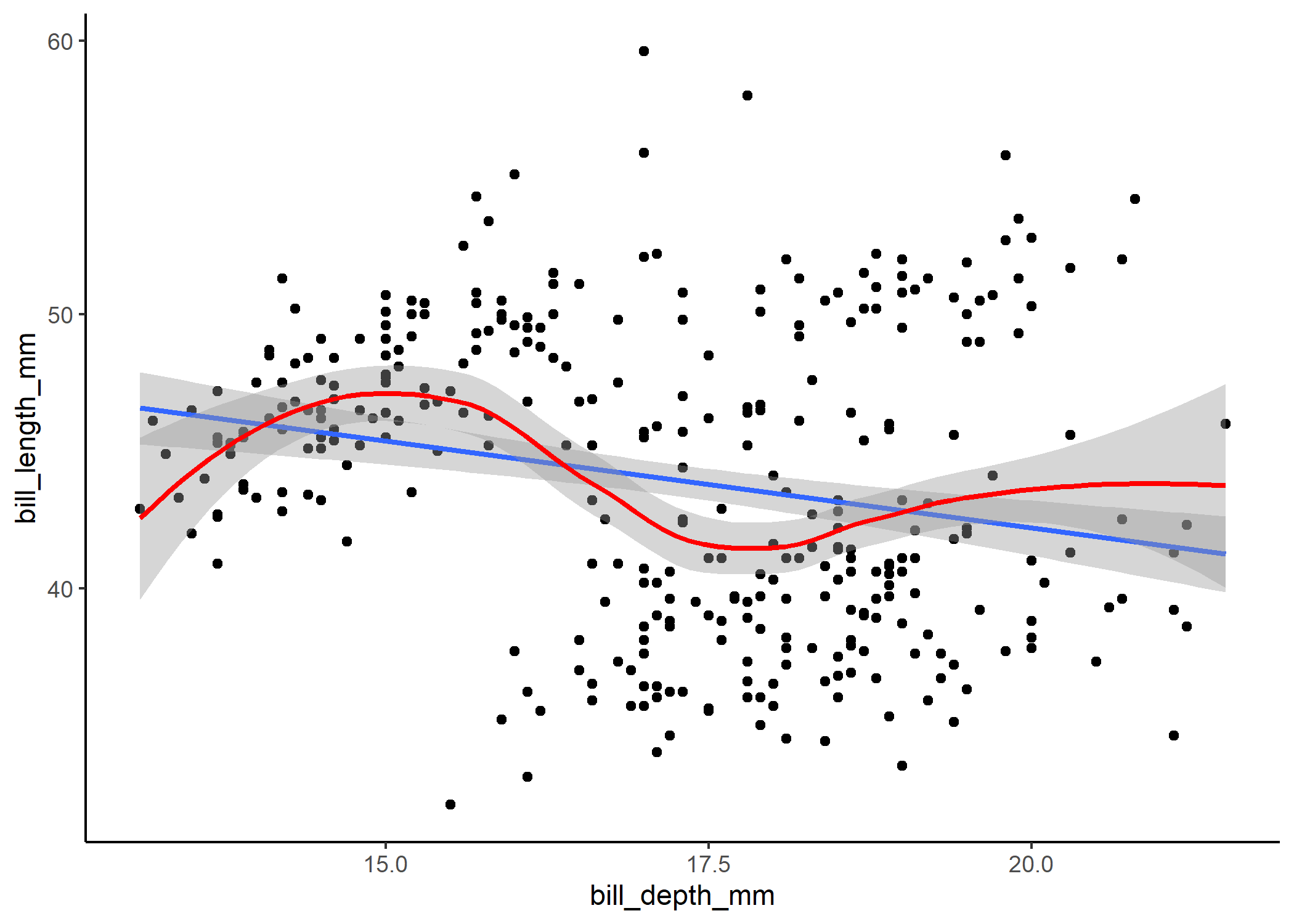
Note that the blue line here is the model fit, and the red line is the smoothed, non-linear trend line. When bill depth is around 15 mm, the model tends to underpredict bill length, whereas when bill depth is around 17.5mm, the model tends to overpredict. The points kind of appear to be clustered too, which raises some suspicions.
Since our distribution doesn’t seem to be the problem, we might infer that we are missing an important parameter in our model that might explain why for certain values of bill depth we’re consistently over or underestimating bill length. You might recall that there are three species of penguins in this dataset - perhaps we need to account for species-specific differences in our model!
mod_cont_spp <- lm(bill_length_mm ~ bill_depth_mm * species, data = df)
summary(mod_cont_spp)
##
## Call:
## lm(formula = bill_length_mm ~ bill_depth_mm * species, data = df)
##
## Residuals:
##     Min      1Q  Median      3Q     Max
## -7.9137 -1.5150  0.0587  1.5733 10.3590
##
## Coefficients:
##                             Estimate Std. Error t value Pr(>|t|)
## (Intercept)                  13.4279     4.8548   2.766 0.005999 **
## bill_depth_mm                 1.9221     0.2631   7.307 2.11e-12 ***
## speciesAdelie                 9.9389     5.7395   1.732 0.084277 .
## speciesGentoo                 3.2423     5.9444   0.545 0.585829
## bill_depth_mm:speciesAdelie  -1.0796     0.3113  -3.468 0.000595 ***
## bill_depth_mm:speciesGentoo   0.1382     0.3483   0.397 0.691692
## ---
## Signif. codes:  0 '***' 0.001 '**' 0.01 '*' 0.05 '.' 0.1 ' ' 1
##
## Residual standard error: 2.445 on 327 degrees of freedom
## Multiple R-squared:  0.8032, Adjusted R-squared:  0.8001
## F-statistic: 266.8 on 5 and 327 DF,  p-value: < 2.2e-16
mod_cont_spp_resids <- simulateResiduals(mod_cont_spp)
plot(mod_cont_spp_resids)
That looks much better! When we plot out the model results below, we can see that the weird patterns in the residuals were definitely caused by the clustering of data within each species. We still see a couple red stars in the residual plot, which are “residual simulation outliers” - which just means that DHARMa isn’t totally confident in the value that it’s estimated for each of these observations. Since the actual outlier test in the first panel is not significant, we can be pretty comfortable in assuming that the raw observations aren’t overly influential.
ggplot(df, aes(x = bill_depth_mm, y = bill_length_mm, colour = species)) +
  geom_point() +
  stat_smooth(method = 'lm') +
  theme_classic()
Random effects
Now that we’ve got the basics of linear modelling down, we’re going to
start throwing in some more complicated components like random effects.
If you use random effects or a non-normal distribution in your model,
the function lm() will no longer work for you. While there are a whole
bunch of packages that will allow you to run more complex models, we’re
only going to use glmmTMB because it is the most flexible, tends to
have fewer computational errors, and can handle a ton of funky model
variations that other packages can’t.
Now, random effects can be a really unintuitive concept because there is quite a bit of subjectivity involved in deciding whether to use them or not. Any categorical variable (but ideally one with more than 5 levels) can technically be treated as a random effect or a fixed effect in a model. What differentiates these two approaches is some of our assumptions about the variable and the type of question we’re asking. If we treat a categorical variable as a fixed effect, we are assuming that each level is independent of the others - any estimates we make for one level don’t influence the estimates we make for the others. This means we can only make inferences from our model about the levels of the variable we actually have data for. If we treat the variable as a random effect, we are assuming that all of the levels come from a normal distribution.
So when should you include a variable as a fixed effect versus a random effect? To choose, we’ll have to revisit our initial hypotheses/questions. If we are specifically interested in only the levels of the categorical variable we actually sampled, then it makes sense to include them as fixed effects. For example, if we specifically want to compare the penguins between Biscoe, Dream, and Torgersen island, and are not interested in broader spatial trends, then we could include island as a fixed effect. Conversely, if we want to assess a general pattern across a population, then we would include the variable as a random effect. For example, if we want to assess penguins across the entire Antarctic region and we just so happen to sample them at Biscoe, Dream, and Torgersen islands, then we would include ‘island’ as a random effect. Other variables that we typically use as random effects include species identity (e.g., if we want to assess the allometric relationship between metabolic rate and body size across animals) and site (e.g., if we want to know the salmon densities across B.C. and sampled various streams across the region).
Here’s how the two options look in practice. Let’s say we want to compare bill depth across islands. We can either treat island as a categorical fixed effect:
mod_fixed <- glmmTMB(bill_depth_mm ~ island, data = df)
summary(mod_fixed)
##  Family: gaussian  ( identity )
## Formula:          bill_depth_mm ~ island
## Data: df
##
##      AIC      BIC   logLik deviance df.resid
##   1329.4   1356.1   -657.7   1315.4      326
##
##
## Dispersion estimate for gaussian family (sigma^2): 3.04
##
## Conditional model:
##                 Estimate Std. Error z value Pr(>|z|)
## (Intercept)      15.8362     0.1950   81.22  < 2e-16 ***
## islandDream       2.5884     0.2912    8.89  < 2e-16 ***
## islandHanelen     1.5238     0.3055    4.99 6.10e-07 ***
## islandHannah      1.2419     0.3055    4.07 4.79e-05 ***
## islandHelen       1.2110     0.3055    3.96 7.36e-05 ***
## islandTorgersen   2.4116     0.4126    5.84 5.08e-09 ***
## ---
## Signif. codes:  0 '***' 0.001 '**' 0.01 '*' 0.05 '.' 0.1 ' ' 1
Or as a random effect:
mod_random <- glmmTMB(bill_depth_mm ~ (1|island), data = df)
summary(mod_random)
##  Family: gaussian  ( identity )
## Formula:          bill_depth_mm ~ (1 | island)
## Data: df
##
##      AIC      BIC   logLik deviance df.resid
##   1342.6   1354.1   -668.3   1336.6      330
##
## Random effects:
##
## Conditional model:
##  Groups   Name        Variance Std.Dev.
##  island   (Intercept) 0.6837   0.8269
##  Residual             3.0969   1.7598
## Number of obs: 333, groups:  island, 6
##
## Dispersion estimate for gaussian family (sigma^2):  3.1
##
## Conditional model:
##             Estimate Std. Error z value Pr(>|z|)
## (Intercept)  17.3136     0.3531   49.03   <2e-16 ***
## ---
## Signif. codes:  0 '***' 0.001 '**' 0.01 '*' 0.05 '.' 0.1 ' ' 1
You’ll notice that instead of presenting a coefficient estimate for each
island, the random effects model only presents an intercept and a single
“island effect” in the random effects portion of the model. We can still
however extract the island-specific estimates using ranef(model_name).
Let’s compare the island-speciic estimates for both models.
Let’s compare the fixed and random effects:
##        island fixed_coef    ran_coef fixed_depth ran_depth        diff
## 1 (Intercept)  15.836249 17.31364910          NA        NA          NA
## 2      Biscoe         NA -1.39823360    15.83625  15.91542 -0.07916640
## 3       Dream   2.588366  1.03859300    18.42461  18.35224  0.07237253
## 4     Hanelen   1.523753  0.04282417    17.36000  17.35647  0.00352893
## 5      Hannah   1.241933 -0.21755112    17.07818  17.09610 -0.01791605
## 6       Helen   1.211023 -0.24610841    17.04727  17.06754 -0.02026819
## 7   Torgersen   2.411580  0.78047562    18.24783  18.09412  0.15370452
##   sample_size
## 1          NA
## 2          80
## 3          65
## 4          55
## 5          55
## 6          55
## 7          23
There are a few key differences here. First, in the fixed effect model, the intercept estimate is actually the bill depth estimate for Biscoe Island (i.e., the first level of the variable). Each island-specific coefficient then refers to how different that island is from our intercept level. In the random effect model however, the intercept estimate is the average estimated bill depth across all islands - in this case, each island-specific estimate is how much they differ from average.
You’ll see that the actual estimated bill depth for each island is very similar between the two models, but that the biggest differences show up for the islands with the most extreme values (i.e., Biscoe and Dream islands) and the site with the smallest sample size (Torgersen). To learn more about why these sites are the most affected by a change in modelling approach, you can check out some helpful tutorials here and here. For this tutorial’s purposes though, what’s important to know is that a fixed-effect model assumes that the islands are totally independent from one another, while the random-effect model assumes that all the subpopulations are normally distributed around some global mean.
Generalized linear modelling (i.e., thinking about distributions and link functions)
Sometimes, running a straight line through data is just not going to do the trick for explaining a relationship between two variables. Often, this is because the data we are interested in are bound in some way - for instance, if our response variable is a count (e.g., number of penguins), we know that we can’t have any negative responses (what is a negative penguin?). If we don’t explicitly account for this in our model, sometimes we can predict impossible results:
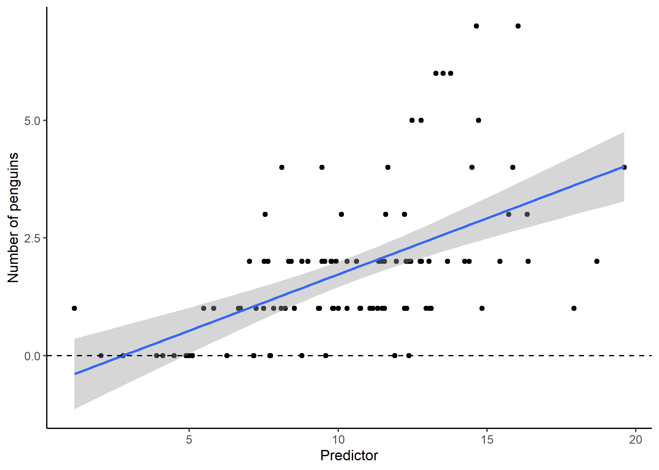
Our model output suggests that for small values of our predictor, we would actually expect to see negative penguins! Not only is this impossible, but the residuals for a model like this tend to look really wonky:
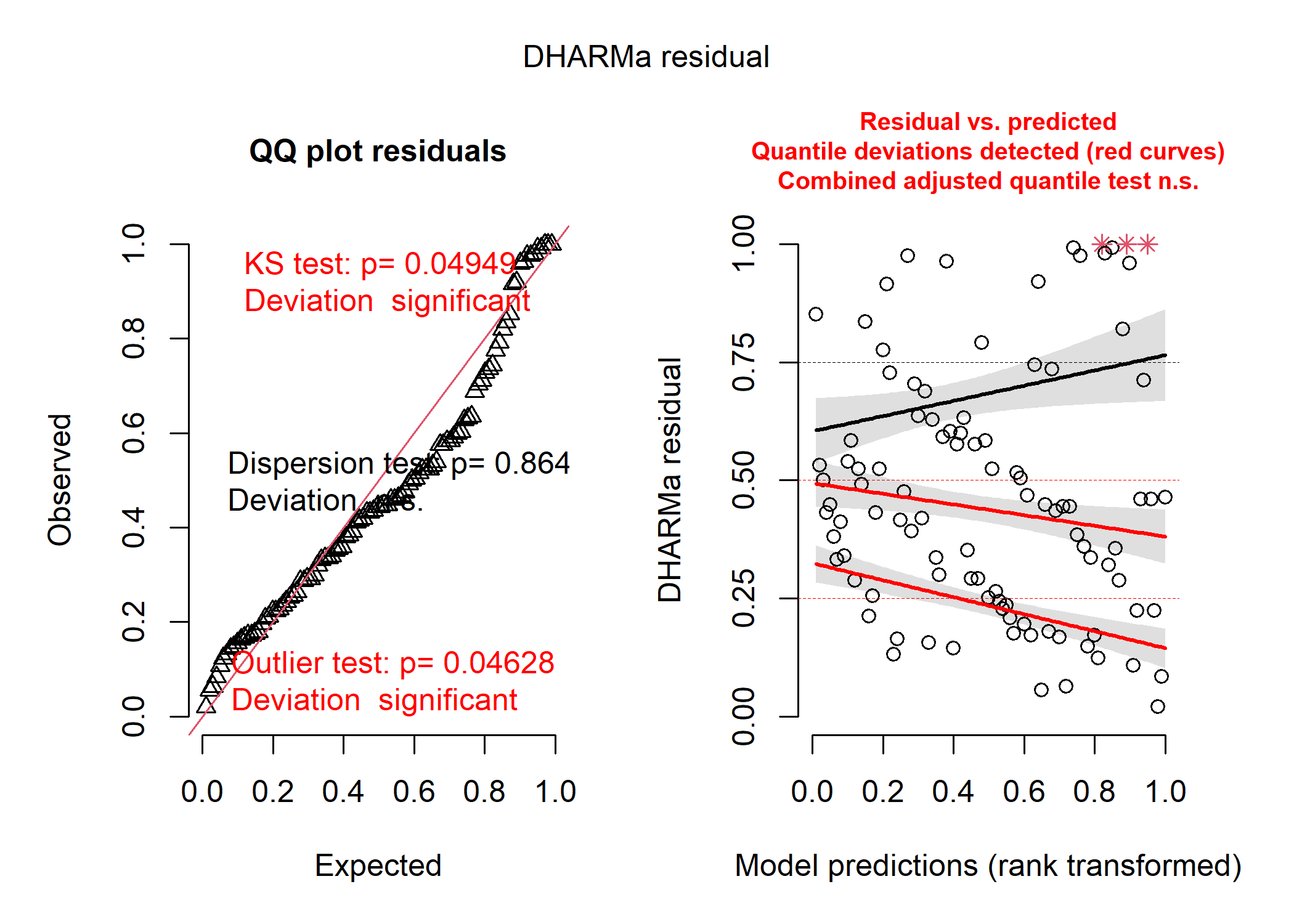
This is partly because when our data are bounded, it tends to be impossible for our residuals to be normally distributed around our model estimates. What we really need is (1) more flexibility in how our residuals can be distributed, and (2) a way to constrain our model to realistic values.
Generalized linear models are our solution to this conundrum! A GLM has two key components that solve our problem above: (1) a non-normal distribution option, and (2) a link function. Let’s look at distributions first.
When we are choosing a distribution to assign to our GLM, we need to look at the distribution of our residuals. As such, we can only really evaluate if we’ve chosen the right distribution after we’ve run our model - but there are lots of context clues we can use to narrow down our choices first! There are a whole bunch of distribution options so we’re only going to cover the most common ones in our field.
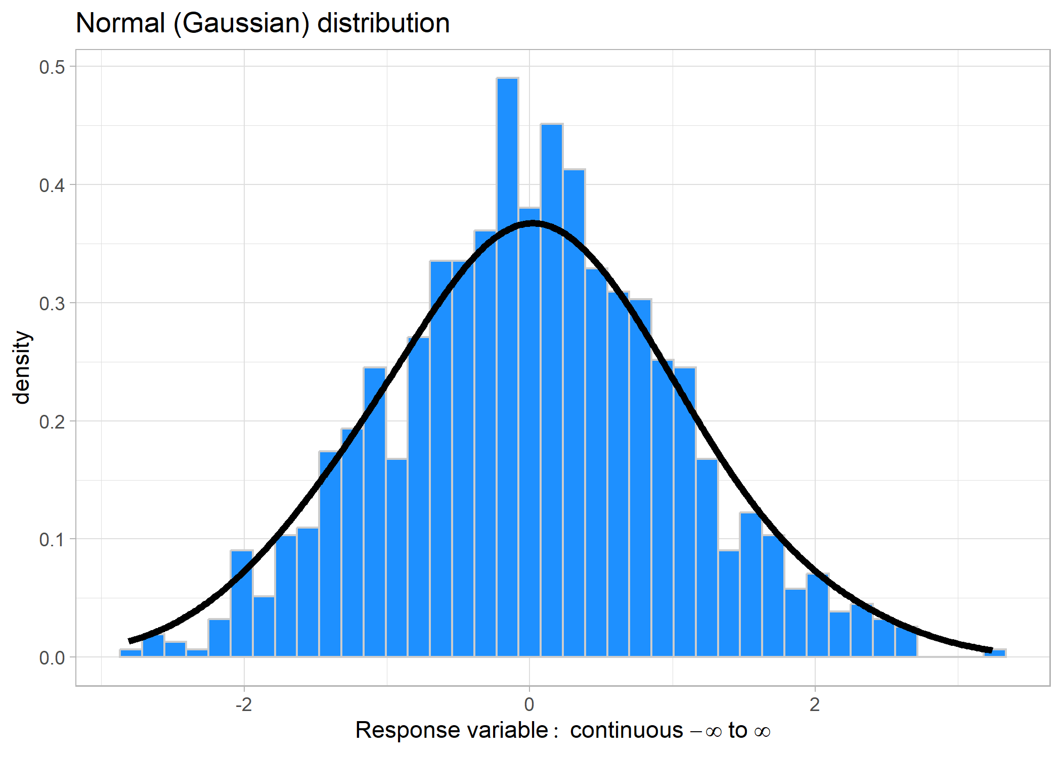
Gaussian distribution
This distribution is the most common, bell-shaped curve. It can take values ranging from − ∞ to ∞. Some common examples might include: changes in a value (e.g., population size), temperature, and some positive-only values such as body size.
We don’t need to specify a link for Gaussian distributions because they
are identical to using lm().
Poisson distribution
Poisson distributions pertain to positive-only (including 0) count data, meaning that the response variable has to be integers (i.e., no decimals). This is commonly used in abundance estimates.
Link: log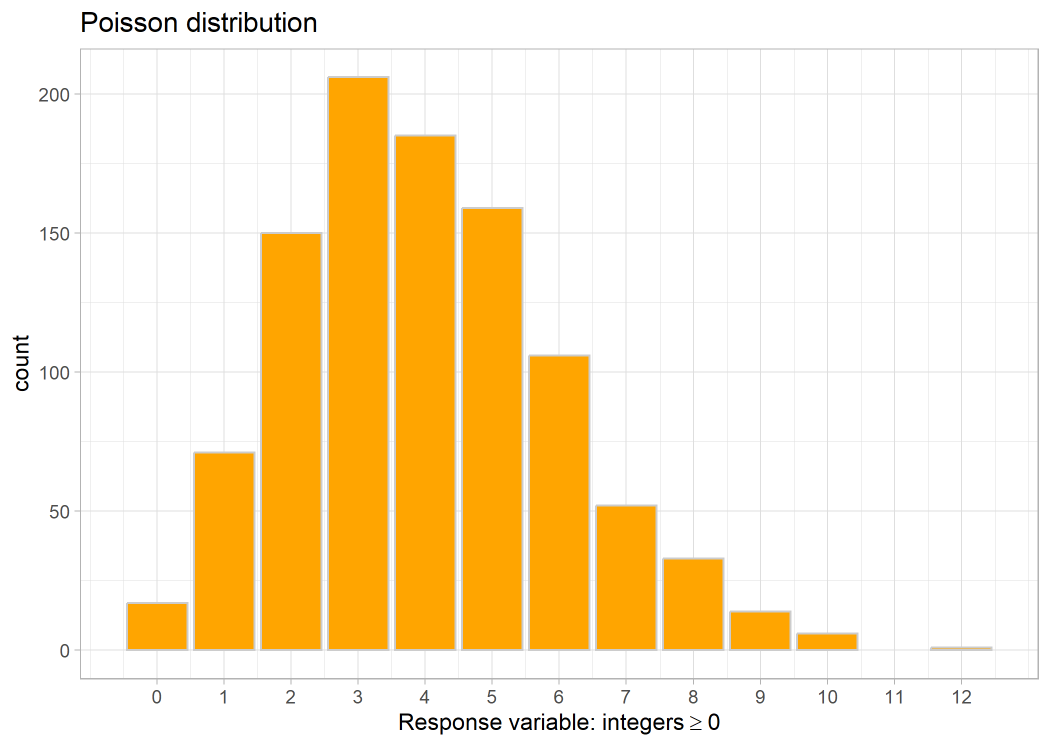
Negative binomial distribution
Sometimes we’ll run a Poisson model and our model checks will tell us that we have overdispersion (i.e., the variation in the data is larger than what you would expect given the mean). In that case, we’ll try a negative binomial distribution. It is still used for count data with zeroes.
Link: log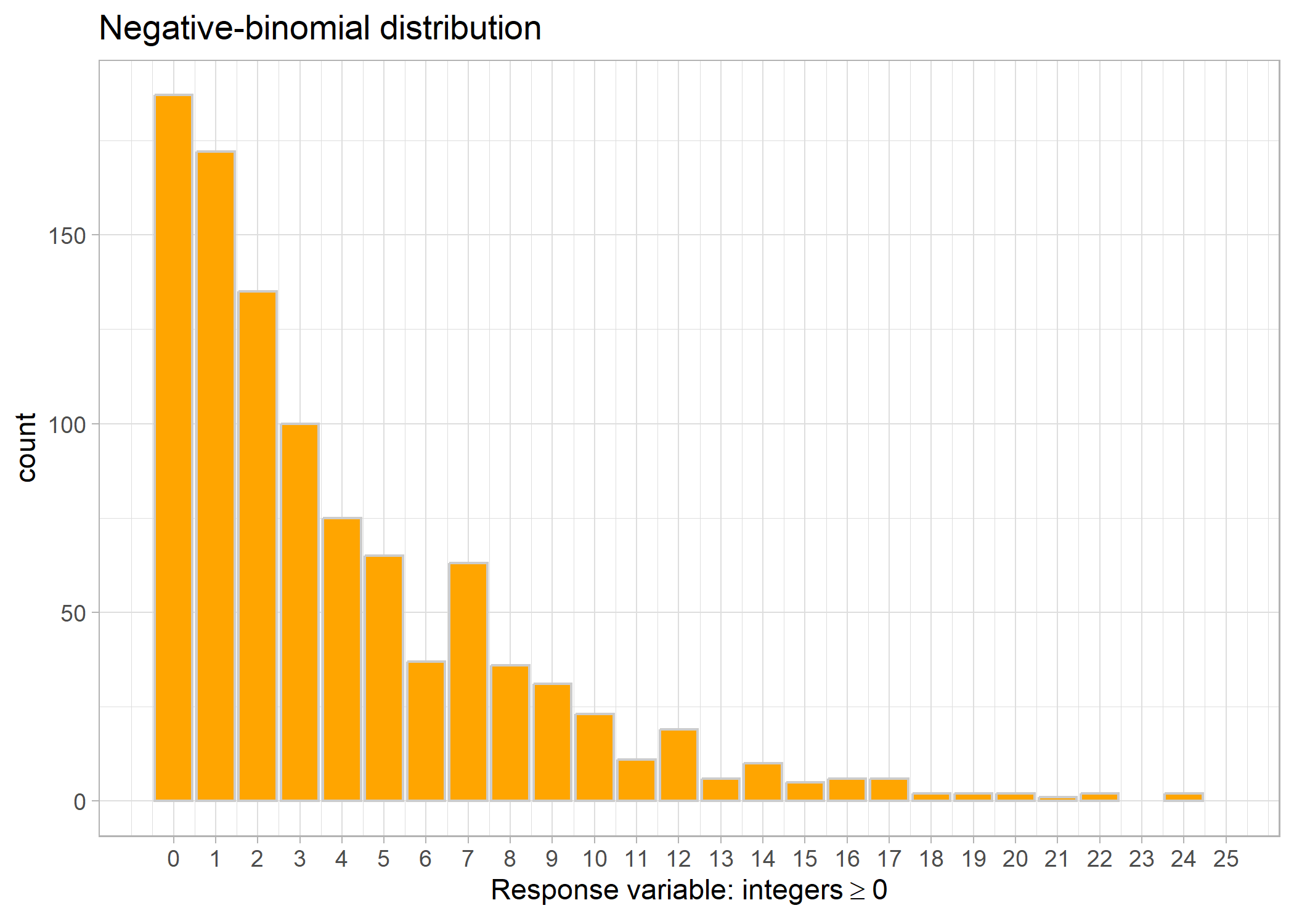
Now, there will be instances when we have too many zeroes, in which
case, we can use a Zero-inflated Negative Binomial distribution. The
application is identical, it just uses some fancy math to deal with all
the number of zeroes. Be careful though, there is a big difference between “a lot of zeros” and “too many zeros”. “Too many zeros” means that our model is underpredicting the number of zeros compared to what we actually observed. You can check for zero inflation by manually comparing the predicted number of zeros with the observed, or by using a handy function like the testZeroInflation() function in DHAMRa.
Gamma distribution
Now, remember up in the Gaussian distribution example, we mentioned that sometimes you can use a Gaussian distribution on positive-only data (e.g., body size)? Well, the other direction that you can go is to use a Gamma distribution - especially if your data are close to 0. Gamma distributions are used for positive-only continuous data excluding zeroes.
Link: log or inverse (we recommend log)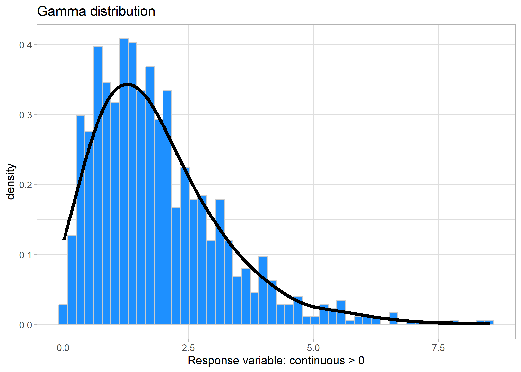
And if we look at the minimum value, it’s > 0:
## [1] 0.01426312
Now, what if you also have zeroes in your dataframe? This is where you’ll need to put on your ecologist hat. Let’s say you’re measuring total fish biomass as a function of various abiotic variables, such as temperature. You come across a number of transects and you have some transects that just have zero fish (and hence, zero fish biomass). What’s going on here? Perhaps, you’re surveying across an area with various levels of fishing pressure and you realize that you’re surveying in an area with a ridiculously high fishing pressure (they are literally wiping away all the fish in the area). The zeroes in your data are likely being generated by another process other than temperature - in this case, fishing pressure. Because you are still interested in understanding the zeroes, and you have a hypothesis around the effects of fishing on fish biomass, then you can use what’s called a Hurdle gamma model.
In short, a hurdle gamma model allows for zeroes, but will use a different distribution to model the 0-1 portion of your data (i.e., it will categorize your data in zero and not-zero) and then a Gamma distribution on the continuous data (i.e., the not-zero side). It will then give you coefficient estimates for both parts of the model (i.e., you are essentially running two separate models).
If your zeroes are not coming from a separate process (i.e., you believe that temperature alone is explaining the zero fish biomass, maybe you’re surveying over a very hot area), then you can use a Tweedie distribution.
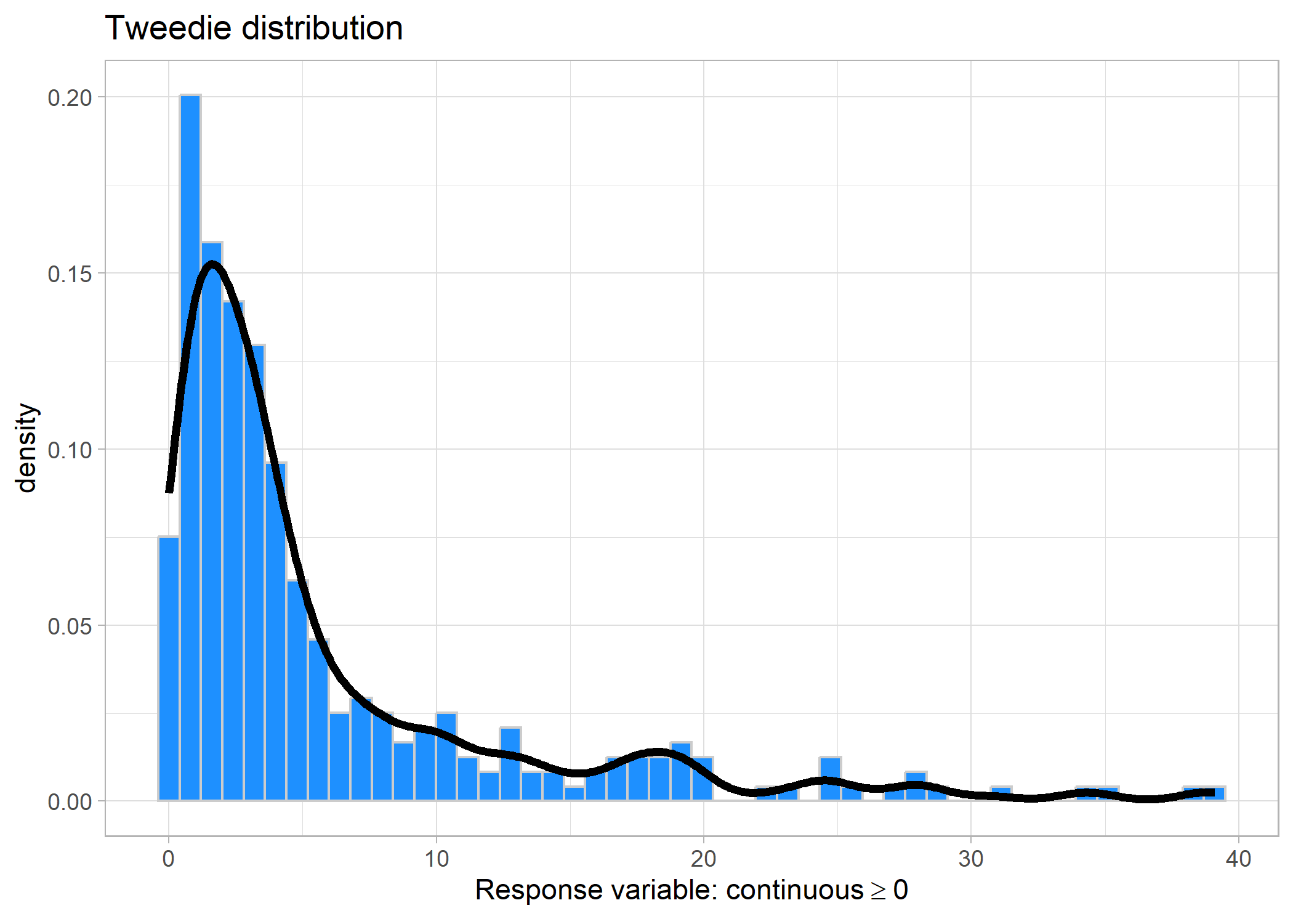
Tweedie distribution
Tweedie distriutions are relatively new in the field of ecology. The math jargony part is that they combine a Poisson distribution and a Gamma distribution, so they are used for data that is continuous and contains zeroes. Because they are relatively newer for ecologists, some of the popular packages that we like to use are not yet supporting Tweedie distributions (but hopefully this changes soon).
Link: logset.seed(123)
f2 <- function(x) 0.2 * x^11 * (10 * (1 - x))^6 + 10 *
(10 * x)^3 * (1 - x)^10
n <- 300
x <- runif(n)
mu <- exp(f2(x)/3+.1);x <- x*10 - 4
tibble(x = rTweedie(mu, p = 1.5, phi = 0.5)) %>%
ggplot(aes(x = x)) +
geom_histogram(aes(y = ..density..), fill = 'dodgerblue', colour = 'grey80', bins = 50) +
geom_density(fill = NA, bw = 1, size = 1.5) +
labs(title = 'Tweedie distribution',
x = expression(Response~'variable:'~continuous>=0)) +
theme_light()
Beta distribution
When you are using proportion data, such as percent cover, then you can use a beta distribution. A beta distribution describes data ranging between 0 and 1 but does not include 0 or 1.
Link: logit (log-odds)set.seed(123)
df_beta <- tibble(x = rbeta(1000, 2, 5))
ggplot(df_beta, aes(x = x)) +
geom_histogram(aes(y = ..density..), bins = 30,
fill = 'dodgerblue', colour = 'grey80') +
geom_density(fill = NA, bw = 0.08, size = 1.5) +
labs(title = 'Beta distribution',
x = 'Response variable: continuous 0 < x < 1') +
theme_light()
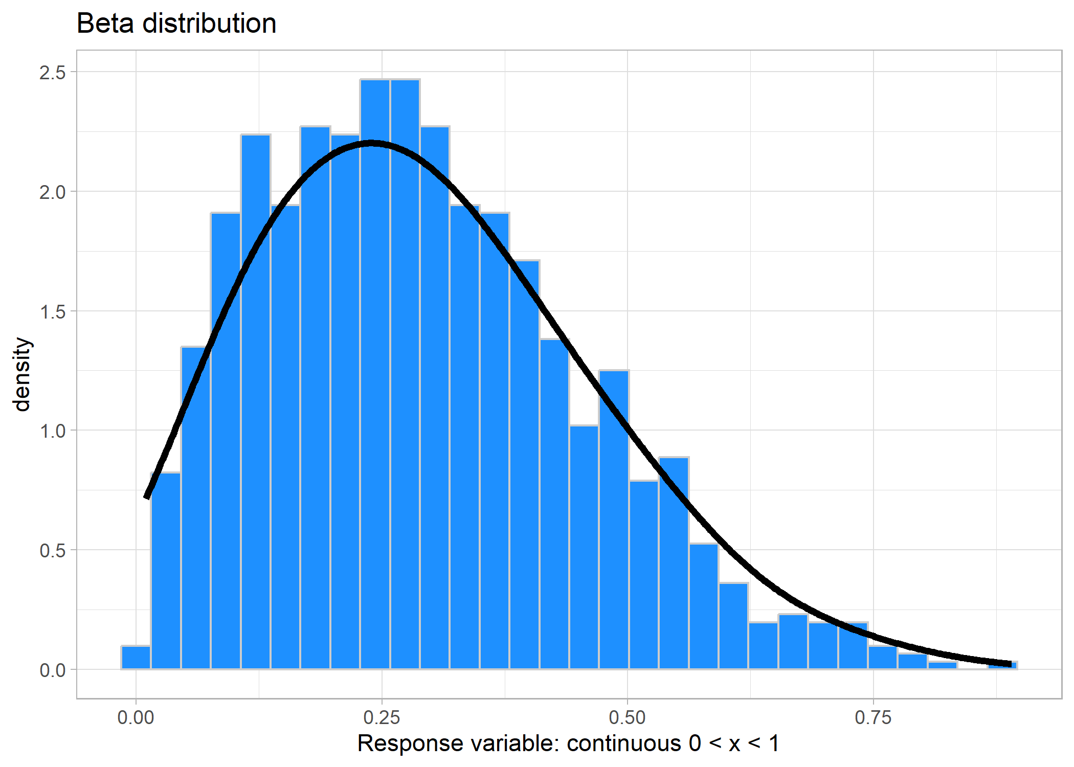
And again, if we look at the minimum and maximum values of the beta distribution:
## # A tibble: 1 x 2
##   min_value max_value
##       <dbl>     <dbl>
## 1   0.00961     0.891
Similar to the Zero-inflated negative binomial, if you happen to have zeroes or ones (or both) in your proportional data, then you can use a Zero-inflated beta, One-flated beta, or Zero-one-inflated beta distribution, respectively. There is a new method coming down the pipes that will essentially do a very similar thing as the Zero-one-inflated beta, but in practice it won’t concern you too much.
Binomial (Bernoulli) distribution
The final distribution that we are going to cover here is the Binomial/Bernoulli distribution. This distribution is used for presence/absence data when you would want to use logistic regression. The data only comprises zeroes and ones. NOTE: it also includes data of counts of successes or failures vs. total number of trials (for example, if you’re counting the number of germinated vs. ungerminated plants). This may seem confusing because, at first, you might want to assign a Poisson or Negative Binomial distribution, but alas, because it is the number of successes out of the total number of trials, it is indeed a Bernoulli (imagine the cliché coin flipping example).
Link: logit (log-odds)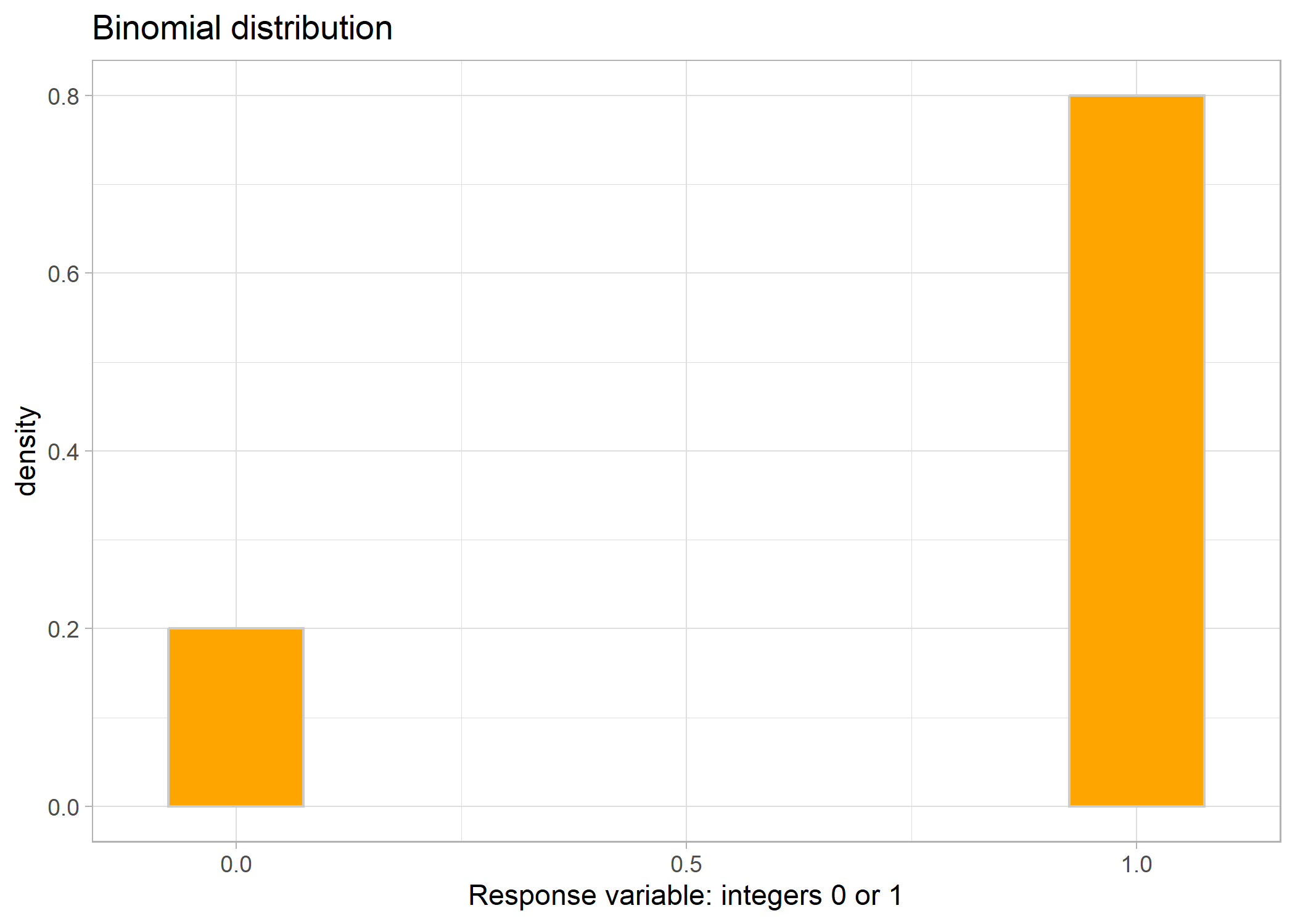
Or, your data might look something like this:
## # A tibble: 10 x 2
##    successes total_number_of_trials
##        <int>                  <dbl>
##  1         3                     12
##  2         6                      8
##  3         3                      9
##  4         6                      9
##  5         7                      9
##  6         1                      7
##  7         4                      6
##  8         7                      9
##  9         4                      5
## 10         4                      7
To code this into a model, you have a number of choices. First, you could convert the dataframe into long format, so each trial gets its own row. If you look at the first row, which has 3 successes out of 12 trials, then to convert to long format you would have 3 rows of 1’s and 9 rows of 0’s (because 12 trials - 3 successes = 9 failures). Conversely, if you don’t want to convert your data into long form, you can keep it in this way, have number of successes as your response, and then set your model weight as the total number of trials.
mod1 <- glmmTMB(proportion_of_successes ~ predictors,
                weights = total_number_of_trials,
                family = binomial(link = 'logit'),
                data)
Testing out different distributions
Since the choice of distribution for a model depends on the distribution of the residuals (not necessarily the raw data), we often have to run a few different model variations and examine the residuals before we can make a choice. However, the summary of the most commonly used distributions described above should help us narrow down the options. For instance, say we were interested in how the flipper length of penguins impacted the number of parasitic mites they have on their bodies. We know that the number of mites has to be an integer because we counted individuals - this tells us there is a good chance that the model distribution should probably be Poisson or negative binomial. Let’s look at the residuals of three versions of our model: normal, Poisson, and negative binomial.
# first let's run a normal gaussian model
mod_norm <- lm(no_mites ~ flipper_length_mm, data = df)

# now look at the simulated residuals
norm_resid <- simulateResiduals(mod_norm)
plot(norm_resid)
# definitely some problems!

mod_pois <- glmmTMB(no_mites ~ flipper_length_mm,
                    family = poisson(link = 'log'),
                    data = df)
# now let's look at the simulated residuals
pois_resid <- simulateResiduals(mod_pois)
plot(pois_resid)
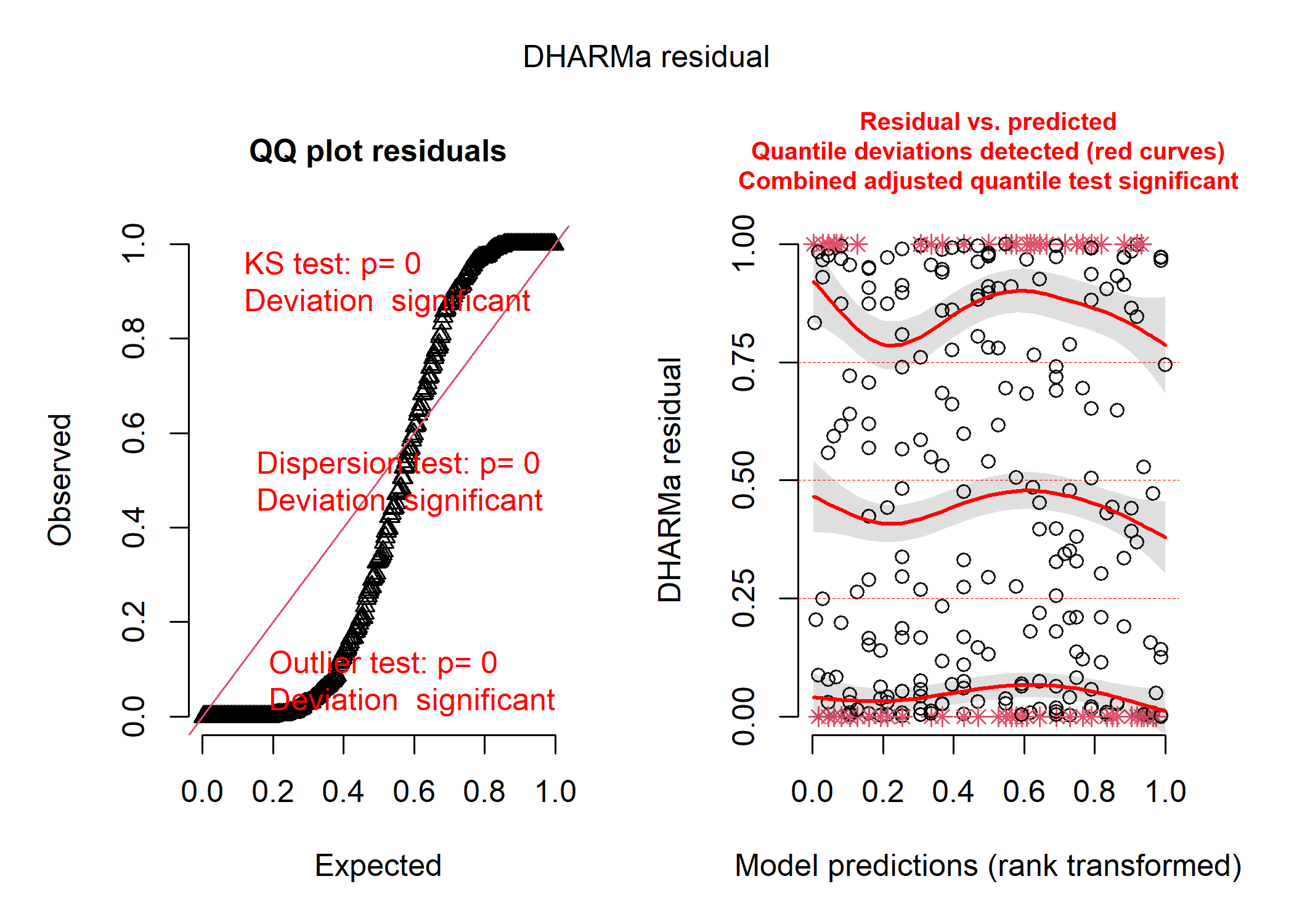
# EXTRA YUCKY!

mod_nb <- glmmTMB(no_mites ~ flipper_length_mm,
                  family = nbinom2(link = 'log'),
                  data = df)

nb_resid <- simulateResiduals(mod_nb)
plot(nb_resid)
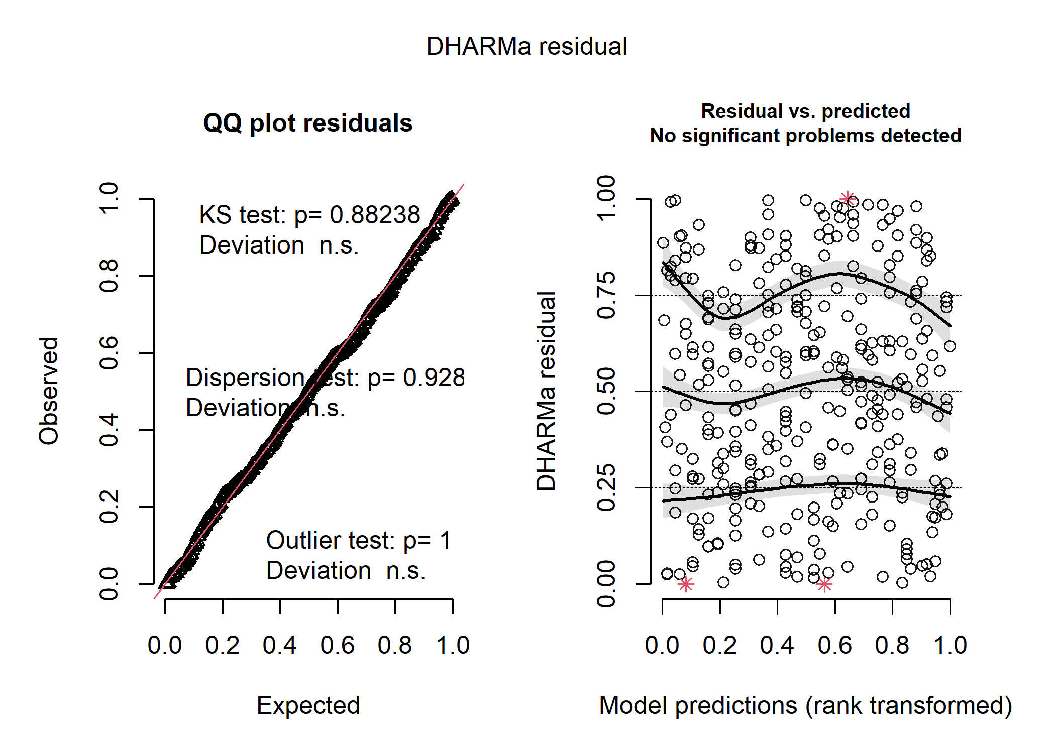
# et voila! she is beautiful!
We can also use a model comparison tool like Aikake’s Information Criterion (AIC) to evaluate which model is the better fit. We won’t get too into the weeds about model selection here (because there are many cases where model selection isn’t a good idea and everyone has lots of opinions on it!), but for our purposes, all you need to know is that the lower the AIC, the better the model.
AIC(mod_norm, mod_pois, mod_nb)
##          df      AIC
## mod_norm  3 2970.116
## mod_pois  2 4983.824
## mod_nb    3 2908.601
The negative binomial model is clearly the best based on both the residuals and our model comparison metric!
Link functions
Interpreting this model is going to be a little more challenging than a basic linear model though, because of link space. The coefficients in our output are still the slope(s) and intercept for a straight line, but they no longer predict our response variable directly. Instead, they predict our link-function-transformed response! So for instance, in our negative binomial model - which uses a log link - our coefficients tell us the slope(s) and intercept for the line that models log(number of mites).
We can’t backtransform any of the predictors (other than the intercept) into real space, so instead we can make predictions in this link space (i.e., predict the log(number of mites) for different values of our predictor), then backtransform these predictions. We’ll use the ggpredict package for this. We can first take a look at the actual “linear” version of our model:
summary(mod_nb)
##  Family: nbinom2  ( log )
## Formula:          no_mites ~ flipper_length_mm
## Data: df
##
##      AIC      BIC   logLik deviance df.resid
##   2908.6   2920.0  -1451.3   2902.6      330
##
##
## Dispersion parameter for nbinom2 family (): 4.92
##
## Conditional model:
##                   Estimate Std. Error z value Pr(>|z|)
## (Intercept)       1.783461   0.379922   4.694 2.68e-06 ***
## flipper_length_mm 0.009796   0.001881   5.207 1.92e-07 ***
## ---
## Signif. codes:  0 '***' 0.001 '**' 0.01 '*' 0.05 '.' 0.1 ' ' 1
ggplot(data = df, aes(x = flipper_length_mm, y = log(no_mites))) +
  geom_point() +
  stat_smooth(method = 'lm') +
  theme_classic()
## `geom_smooth()` using formula = 'y ~ x'
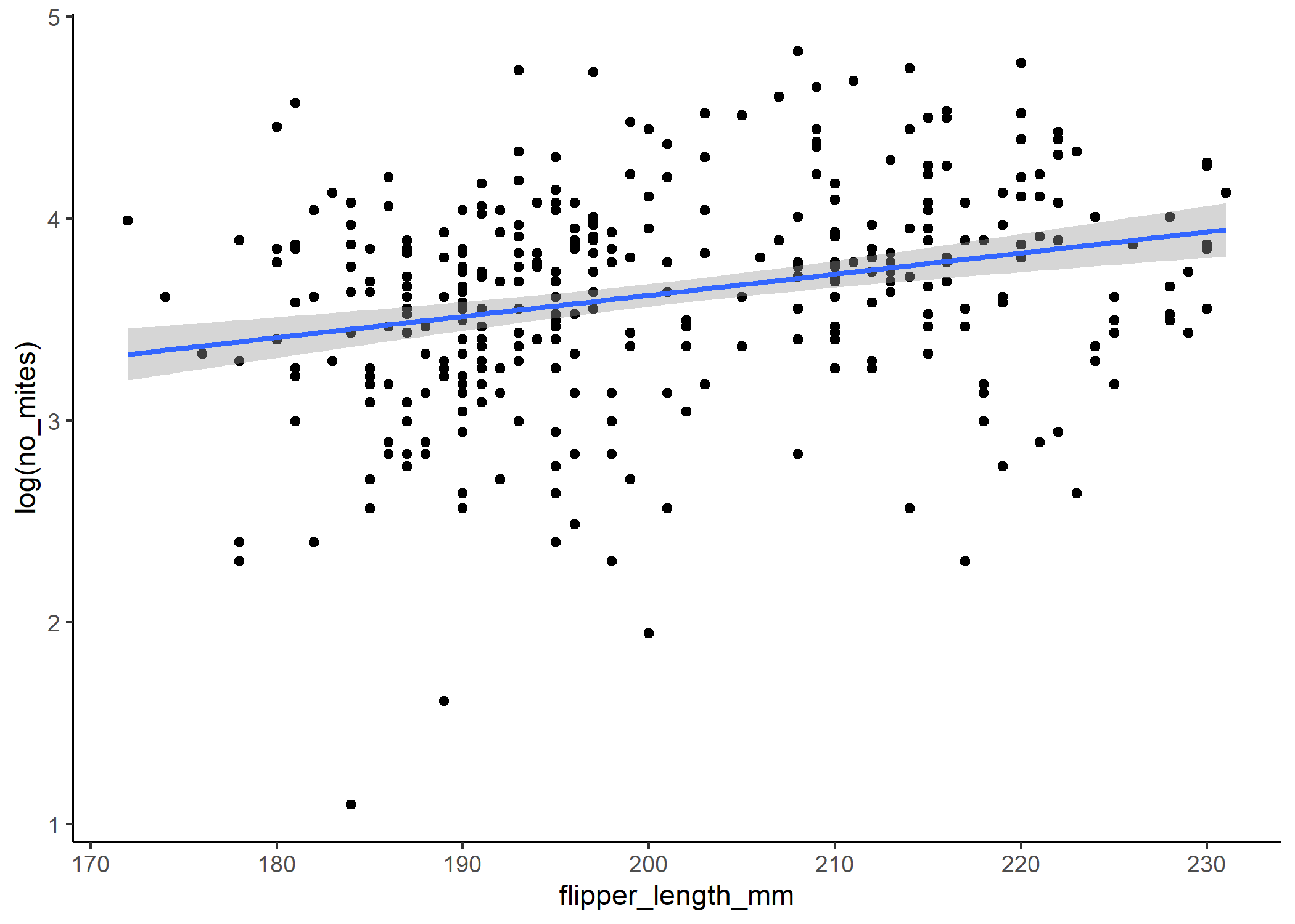
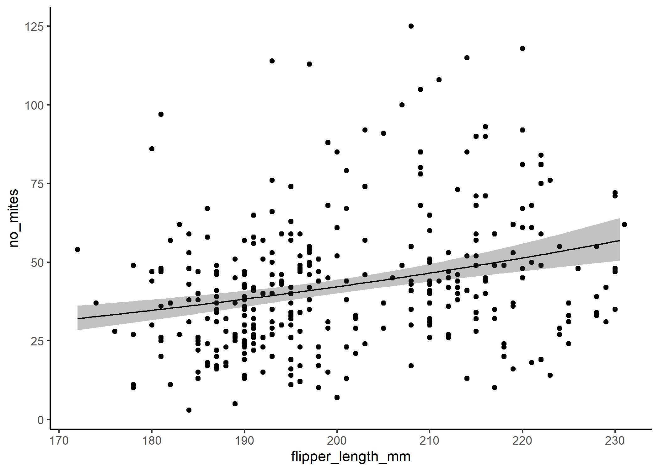
If we backtranform the predictions using the inverse of the link function - in this case exp() - then we can see that the relationship isn’t linear on the scale of our actual response:
#ggpredict will automatically backtransform our predictions unless we tell it
#not to!
predict_nb <- ggpredict(mod_nb, terms = "flipper_length_mm[n=100]") %>%
                        #note that specifying n= in square brackets just
                        #tells ggpredict that you want it to create a
                        #larger df, which can help smooth out the plot
                        #you can also specify a range here instead
                        #(e.g., [10,30])
    #now we'll rename some of these columns so they line up with our original df
    rename(flipper_length_mm = x)

ggplot(df, aes(x = flipper_length_mm, y = no_mites)) +
  #plot the raw data
  geom_point() +
  #now plot the  model output
  geom_ribbon(data = predict_nb,
              aes(y = predicted, ymin = conf.low, ymax = conf.high),
              alpha = 0.3) +
  geom_line(data = predict_nb,
            aes(y = predicted)) +
  theme_classic()
The only other trick to know here is that if you’ve standardized your response variable to put it into the model (which you should!), you’ll also have to backtransform the predictor column before you plot anything.
mod_nb_stand <- glmmTMB(no_mites ~ flipper_length_stand,
                  family = nbinom2(link = 'log'),
                  data = df)

predict_nb_stand <- ggpredict(mod_nb_stand,
                              terms = "flipper_length_stand[n=100]") %>%
                        #note that specifying n= in square brackets just
                        #tells ggpredict that you want it to create a
                        #larger df, which can help smooth out the plot
                        #you can also specify a range here instead
                        #(e.g., [10,30])
    #now we'll backtransform our predictor column so it lines up with our
    #original df
    #to do that, all we need to do is the inverse of the scale() function - so
    #we just multiply the standardized value by the SD of the original data and
    #add the mean
    mutate(flipper_length_mm =
             x*sd(df$flipper_length_mm)+mean(df$flipper_length_mm))

ggplot(df, aes(x = flipper_length_mm, y = no_mites)) +
  #plot the raw data
  geom_point() +
  #now plot the  model output
  geom_ribbon(data = predict_nb_stand,
              aes(y = predicted, ymin = conf.low, ymax = conf.high),
              alpha = 0.3) +
  geom_line(data = predict_nb,
            aes(y = predicted)) +
  theme_classic()
![]()
One other note about distributions
Note that our predictor variables only really need to be uniformly distributed (i.e., relatively even across) and do not need to follow the same distribution as our response variable. If your predictors aren’t evenly distributed, that’s not the end of the world - it just means you need to be keeping a closer eye on how outliers may be influencing your results.
The entire modelling workflow
Now let’s work through a more complicated example and run through all the steps that we would do as if we’re seeing this data for the first time - mind you, this isn’t really the first time we’re seeing this because we’ve already collected the data, so we have an idea of the types of variables we want to include!
Let’s take a look at our dataframe:
head(df)
## # A tibble: 6 x 13
##   species island bill_length_mm bill_depth_mm flipper_length_~ body_mass_g sex
##   <fct>   <chr>           <dbl>         <dbl>            <int>       <int> <fct>
## 1 Adelie  Torge~           39.1          18.7              181        3750 male
## 2 Adelie  Torge~           39.5          17.4              186        3800 fema~
## 3 Adelie  Torge~           40.3          18                195        3250 fema~
## 4 Adelie  Hannah           36.7          19.3              193        3450 fema~
## 5 Adelie  Helen            39.3          20.6              190        3650 male
## 6 Adelie  Hanel~           38.9          17.8              181        3625 fema~
## # ... with 6 more variables: year <int>, bill_length_stand <dbl>,
## #   bill_depth_stand <dbl>, flipper_length_stand <dbl>, body_mass_stand <dbl>,
## #   no_mites <dbl>
Step 0: Ask your question
This may sounds like a no-brainer, but it is arguably the most important step in this whole process. Once you start getting into the weeds of your code, it can be easy to lose sight of the point of your analysis: to answer a biological question. Thinking clearly about what this question is will help you make a lot of the subjective modelling decisions down the line, and avoid fishing for just any kind of significant relationship that might exist.
Exploratory data analysis (i.e., plotting the relationships between the variables we’re interested in) can be a helpful part of this step and is a great way to get familiar with your data. However, hopefully you’ll think about the goal of your work before you collect the data too!
Let’s say for this example, we’re really interested in species-specific differences in parasitism (specifically mite prevalence) across the Antarctic, after accounting for differences in body size.
Step 1: Choose a distribution
Since we want to know what predicts the number of mites in penguins, let’s look at the distribution of the number of mites.
ggplot(df, aes(x = no_mites)) +
  geom_histogram(bins = 30) +
  theme_classic()
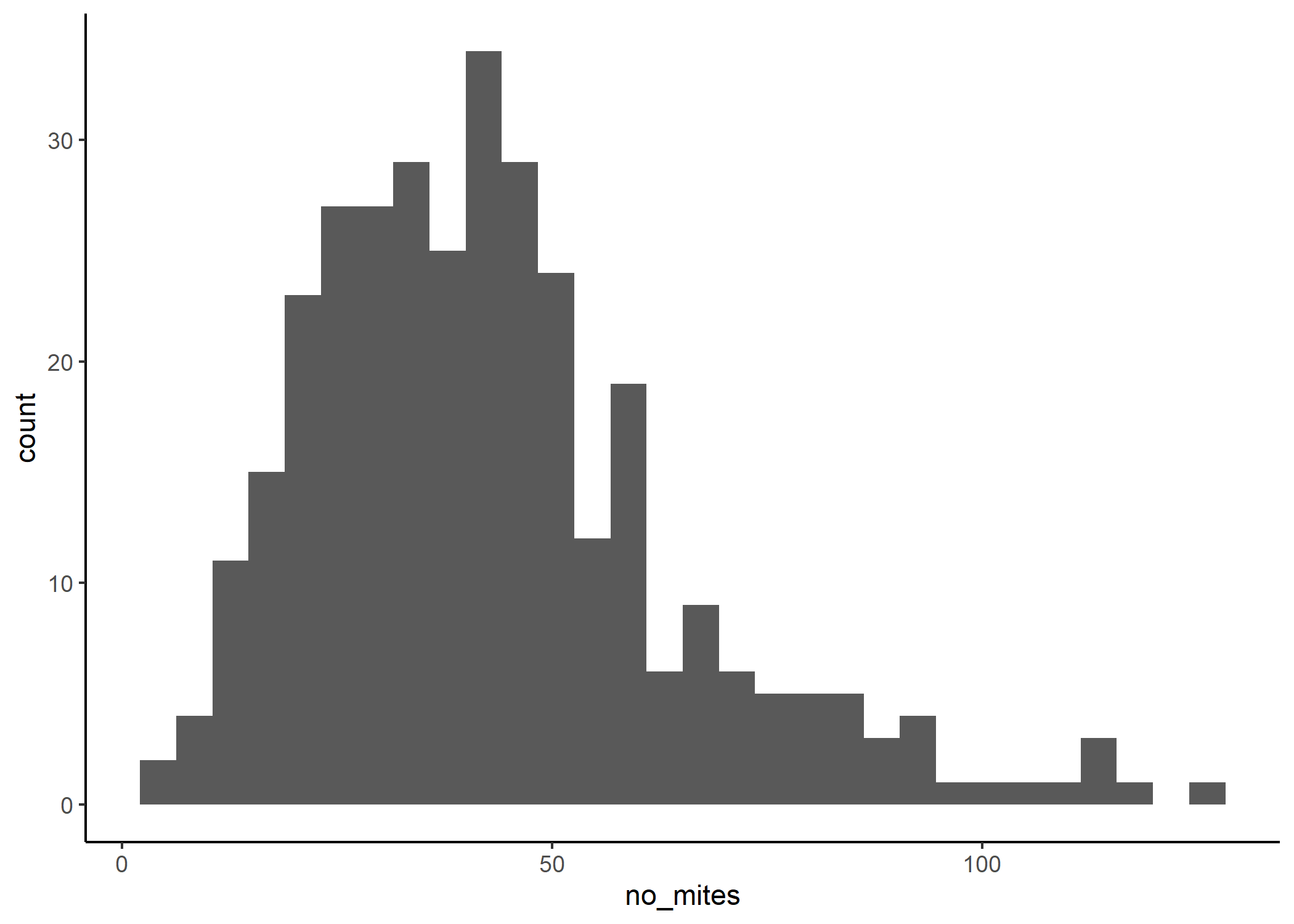
OK, so we have a few choices here. We can see that we have positive-only data. It also appears that our data comprises integers only.
str(df$no_mites)
## num [1:333] 48 32 74 35 28 36 59 37 56 20 ...
Now, we could use a Poisson or a negative-binomial distribution to model this. You could however argue that our data also sort of looks normal-ish (if you really squint). So, we could also try a Gaussian distribution.
There are a number of packages that can also give you a good starting
point on choosing distributions, like the check_distribution()
function from the performance package. With that in mind though, it
will sometimes suggest some pretty weird distributions that are not
necessarily realistic or easy to work with.
So, we’re going to try to run three models: one specifying a Gaussian (normal) distribution, one specifying a Poisson distribution with a log link, and one specifying a Negative binomial distribution with a log link. We’ll then compare the performance of the three models before choosing our final model.
Step 2: Choose your predictors
Now it’s time to build our models. So we want to know if there are species-specific differences in mite prevalence in penguins, after correcting for body size. To collect our data, we went to six different islands: Torgersen, Biscoe, Dream, Hannah, Helen, and Hanelen. Recall that it is always best practice to scale and centre your continuous variables: to avoid issues down the line with weird data structures, it’s always better to create separate columns in your dataframe than to use the scale function in the model formula.
Now, we have two categorical variables, species and island, that could be treated as fixed or random effects. To decide what to do with each, we can think back to our big picture question: we want to understand the mite prevalence in three specific species, across the Antarctic. Since we’re not interested in penguins in general, it might be best to treat species as a fixed effect. And since we’re interested in these trends across a broad spatial scale (and not island-specific trends), it’s probably best to treat island as a random effect.
So, if we build our full models, it would look something like:
# Gaussian distribution
mod_norm_full <- glmmTMB(no_mites ~ bill_length_stand + flipper_length_stand +
                      species + (1|island),
                    family = 'gaussian',
                    data = df)
summary(mod_norm_full)
##  Family: gaussian  ( identity )
## Formula:
## no_mites ~ bill_length_stand + flipper_length_stand + species +
##     (1 | island)
## Data: df
##
##      AIC      BIC   logLik deviance df.resid
##   2972.0   2998.7  -1479.0   2958.0      326
##
## Random effects:
##
## Conditional model:
##  Groups   Name        Variance  Std.Dev.
##  island   (Intercept) 6.285e-05  0.007928
##  Residual             4.220e+02 20.543814
## Number of obs: 333, groups:  island, 6
##
## Dispersion estimate for gaussian family (sigma^2):  422
##
## Conditional model:
##                      Estimate Std. Error z value Pr(>|z|)
## (Intercept)           36.9698     3.7036   9.982   <2e-16 ***
## bill_length_stand      4.8283     2.3845   2.025   0.0429 *
## flipper_length_stand   0.2241     2.7214   0.082   0.9344
## speciesAdelie          5.3701     4.9648   1.082   0.2794
## speciesGentoo         10.3109     5.4388   1.896   0.0580 .
## ---
## Signif. codes:  0 '***' 0.001 '**' 0.01 '*' 0.05 '.' 0.1 ' ' 1
# Poisson distribution
mod_pois_full <- glmmTMB(no_mites ~ bill_length_stand + flipper_length_stand +
                      species + (1|island),
                    family = poisson(link = 'log'),
                    data = df)
summary(mod_pois_full)
##  Family: poisson  ( log )
## Formula:
## no_mites ~ bill_length_stand + flipper_length_stand + species +
##     (1 | island)
## Data: df
##
##      AIC      BIC   logLik deviance df.resid
##   4906.7   4929.5  -2447.3   4894.7      327
##
## Random effects:
##
## Conditional model:
##  Groups Name        Variance Std.Dev.
##  island (Intercept) 0.0041   0.06403
## Number of obs: 333, groups:  island, 6
##
## Conditional model:
##                      Estimate Std. Error z value Pr(>|z|)
## (Intercept)          3.643051   0.039722   91.71  < 2e-16 ***
## bill_length_stand    0.103826   0.017690    5.87 4.38e-09 ***
## flipper_length_stand 0.007057   0.020419    0.35   0.7296
## speciesAdelie        0.085640   0.038614    2.22   0.0266 *
## speciesGentoo        0.225223   0.043040    5.23 1.67e-07 ***
## ---
## Signif. codes:  0 '***' 0.001 '**' 0.01 '*' 0.05 '.' 0.1 ' ' 1
# Negative binomial distribution
mod_nb_full <- glmmTMB(no_mites ~ bill_length_stand + flipper_length_stand +
                    species + (1|island),
                    family = nbinom2(link = 'log'),
                    data = df)
summary(mod_nb_full)
##  Family: nbinom2  ( log )
## Formula:
## no_mites ~ bill_length_stand + flipper_length_stand + species +
##     (1 | island)
## Data: df
##
##      AIC      BIC   logLik deviance df.resid
##   2910.1   2936.8  -1448.1   2896.1      326
##
## Random effects:
##
## Conditional model:
##  Groups Name        Variance  Std.Dev.
##  island (Intercept) 4.156e-10 2.039e-05
## Number of obs: 333, groups:  island, 6
##
## Dispersion parameter for nbinom2 family (): 5.03
##
## Conditional model:
##                      Estimate Std. Error z value Pr(>|z|)
## (Intercept)           3.61167    0.08316   43.43   <2e-16 ***
## bill_length_stand     0.11602    0.05266    2.20   0.0276 *
## flipper_length_stand  0.01978    0.06037    0.33   0.7431
## speciesAdelie         0.13674    0.11355    1.20   0.2285
## speciesGentoo         0.21930    0.11928    1.84   0.0660 .
## ---
## Signif. codes:  0 '***' 0.001 '**' 0.01 '*' 0.05 '.' 0.1 ' ' 1
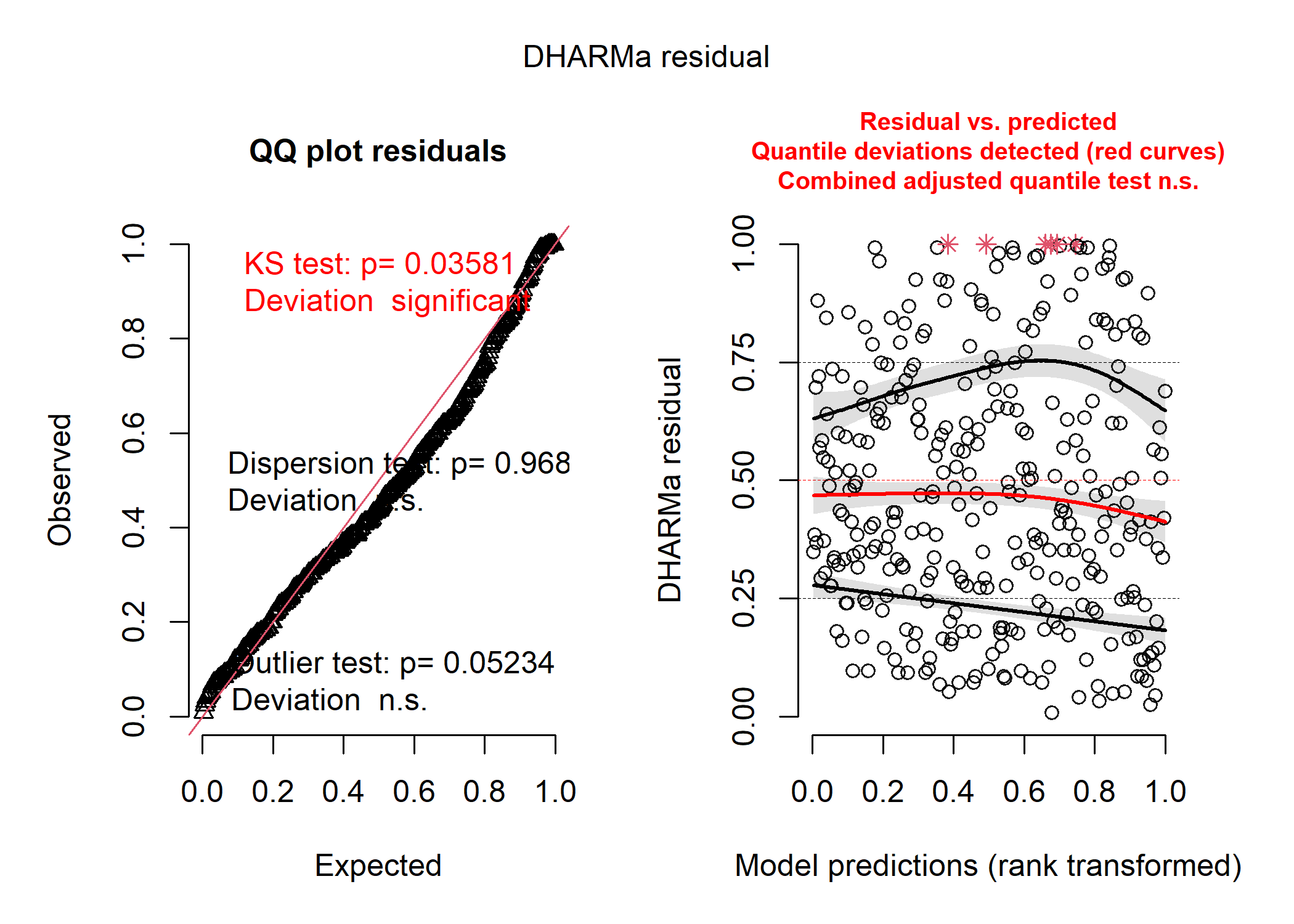
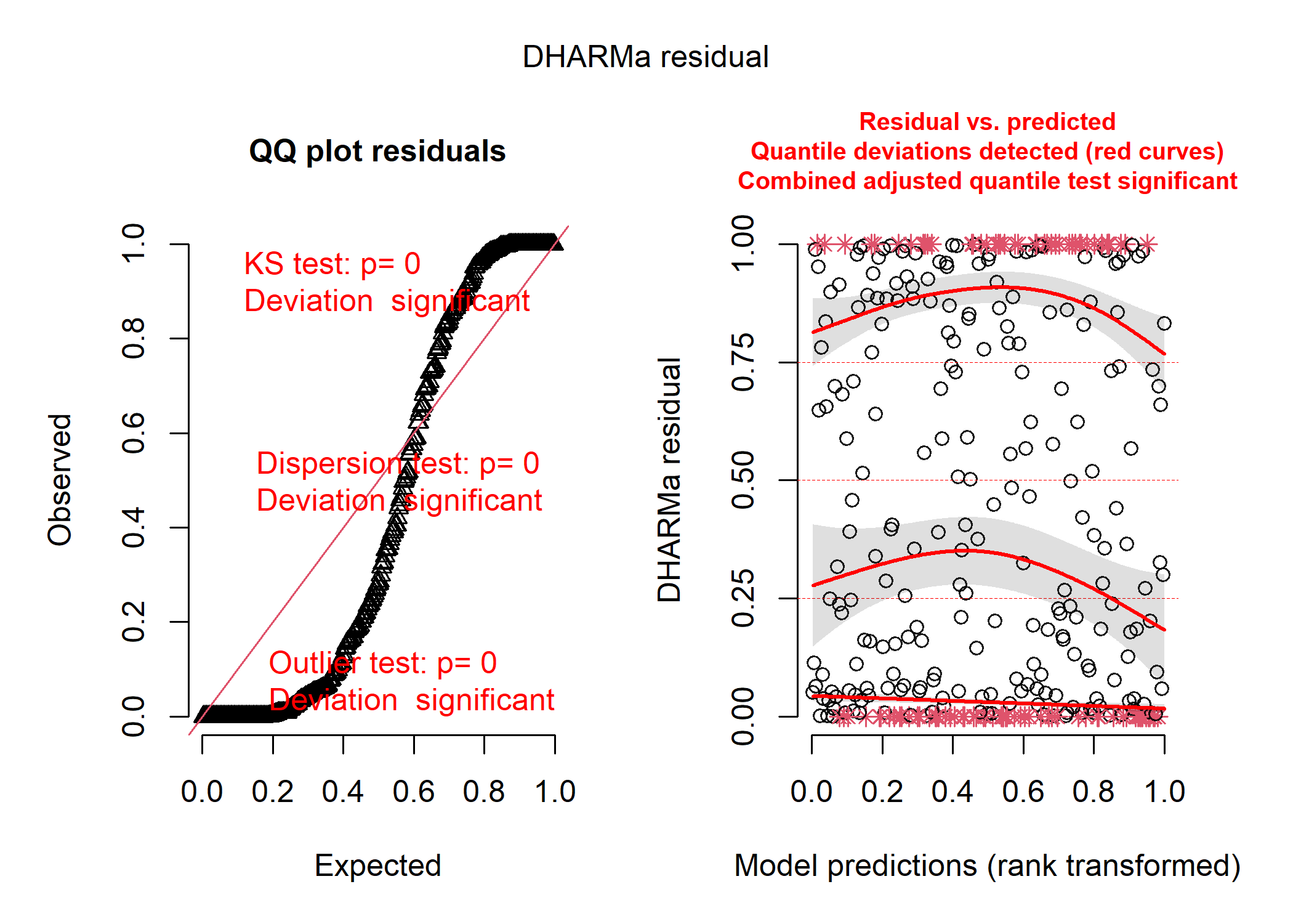
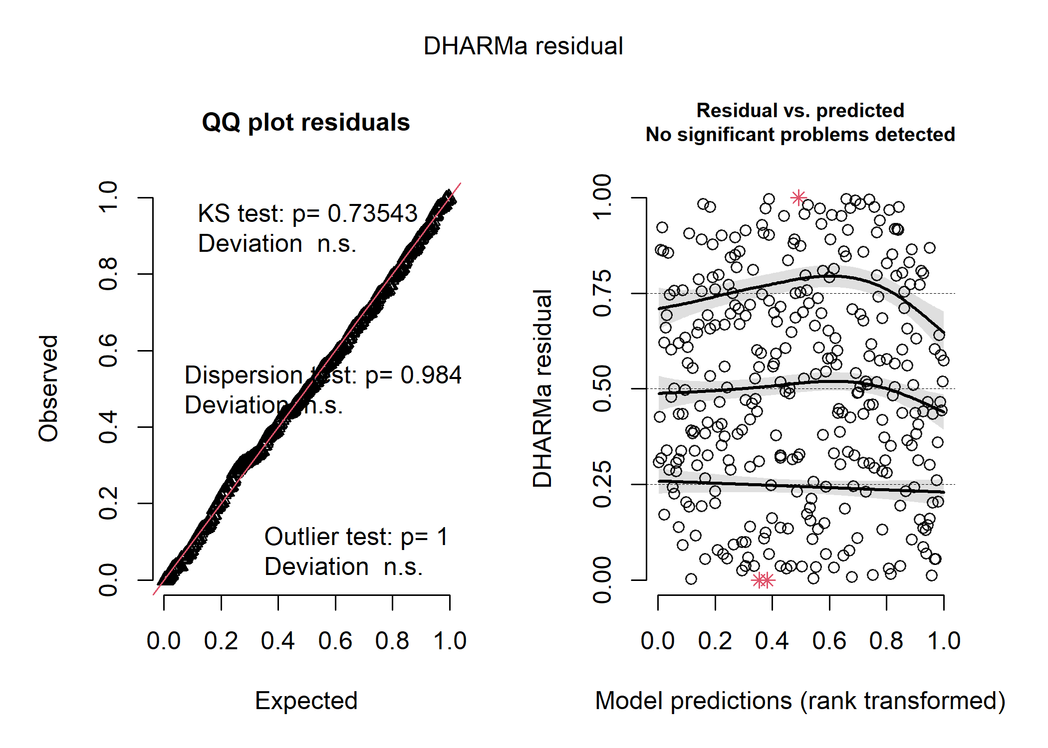
Step 3: Model residuals
Let’s look at the simulated residuals from each model. This will help us
pick a distribution and it will also help us ensure that we have fit the
model properly. We’ll use the DHARMa package.
The normal distribution:
norm_resid <- simulateResiduals(mod_norm_full)
plot(norm_resid)
The Poisson distribution:
pois_resid <- simulateResiduals(mod_pois_full)
plot(pois_resid)
The Negative binomial distribution:
nb_resid <- simulateResiduals(mod_nb_full)
plot(nb_resid)
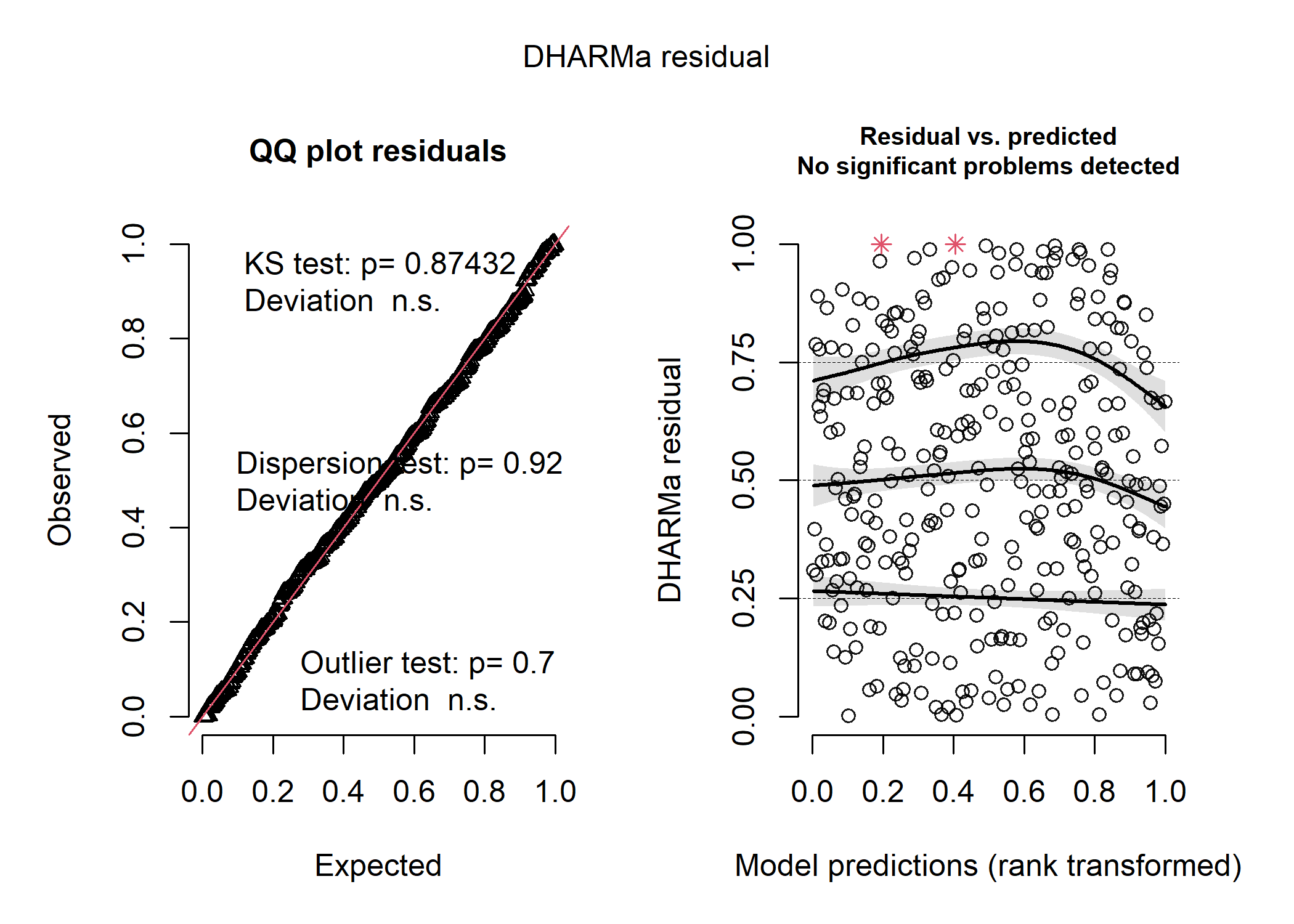
So, the negative binomial distribution looks pretty good! The Poisson distribution looks disgusting, and the shape of the data in the first plot tell us that the residuals are very overdispersed, which is usually a good indication that a negative binomial model is better. The normal distribution isn’t as bad, but it’s definitely not as good as the negative binomial.
Another way that we can choose a distribution is to compare the AIC of each model and choose the model with the smallest AIC.
##               df      AIC
## mod_norm_full  7 2972.039
## mod_pois_full  6 4906.672
## mod_nb_full    7 2910.102
So here, we can see that the Poisson distribution has the highest AIC and the negative binomial distribution has the lowest. So we have another line of evidence that negative binomial is the right fit! This makes a lot of sense considering we have ecological count data, which are almost always negative binomially distributed.
Step 4: Check for collinearity of predictors
Before moving forward, let’s make sure that we can actually include each
variable in our model and that we don’t have too much collinearity. To
do so, we’ll use the car package. Most VIF calculations were not
designed for categorical effects and will often yield super high numbers
that might make you think your model is crap - the car package is nice
because it applies a correction for this! The only issue with car is
that it can’t handle a lot of model types (unlike the
check_collinearity() function in performance). So to use it, you can
create a simplified linear model with all the same fixed effects and no
random effects or non-normal distributions (Paul
Buerkner
says it’s ok to do this, and I would trust him with my life).
Here is the car output (we care about the last column):
car::vif(lm(no_mites ~ bill_length_stand + flipper_length_stand +
                      species, data = df))
##                           GVIF Df GVIF^(1/(2*Df))
## bill_length_stand     4.472666  1        2.114868
## flipper_length_stand  5.825742  1        2.413657
## species              11.385254  2        1.836901
We can see that even with the correction in car, the VIFs are a little bit high for the continuous variables (especially flipper length). Some people will use 3 or 5 as a cut offs - but at the end of the day, the higher your VIFs, the more likely you are to not detect an effect of one of your predictors (so at least it’s a conservative error!). Also note that if you only have continuous predictors, this last column won’t show up and you can just use the uncorrected VIFs.
What to do next really depends on the goal of your analysis. For us, we really wanted to understand the effect of species on mite prevalence, and only included the body size metrics as a way of accounting for differences between species. So, our best option here would be to take out one of the body size metrics, since the other can account for most of the variation anyways!
mod_nb2 <- glmmTMB(no_mites ~ bill_length_stand + species + (1|island),
                    family = nbinom2(link = 'log'),
                    data = df)
Now we can check for multicollinearity again:
car::vif(lm(no_mites ~ bill_length_stand + species, data = df))
##                       GVIF Df GVIF^(1/(2*Df))
## bill_length_stand 3.407875  1        1.846043
## species           3.407875  2        1.358692
Nice! We were able to reduce the VIFs down below our threshold. This is one way to deal with collinearity problems - just keep removing variables one at a time and reassessing. However, you can also condense correlated variables using a PCA or compete models (e.g., a model with one of the correlated predictors versus a model with the other) using AIC. The choice will always depend on your overall question!
Now let’s just make sure the DHARMa residuals are still fine in our reduced model:
resid_nb2 <- simulateResiduals(mod_nb2)
plot(resid_nb2)
Step 5: Plotting and interpreting results
Since we’re most interested in looking at species-specific differences in parasite load, we’ll likely want to run a post-hoc test to compare all of the groups. We can go back to using emmeans for this, but we just need to remember that emmeans will be running the test with our log-link function:
emmean_final_log_scale <- emmeans(mod_nb2, pairwise ~ species)
emmean_final_log_scale$contrast
##  contrast           estimate     SE  df t.ratio p.value
##  Chinstrap - Adelie   -0.142 0.1125 327  -1.262  0.4178
##  Chinstrap - Gentoo   -0.250 0.0733 327  -3.412  0.0021
##  Adelie - Gentoo      -0.108 0.0930 327  -1.163  0.4762
##
## Results are given on the log (not the response) scale.
## P value adjustment: tukey method for comparing a family of 3 estimates
We can see that the only significant contrast is that Chinstrap penguins have fewer mites than Gentoo penguins. But the magnitude of these differences is hard to interpret on the log scale. Luckily we can specify that we want emmeans to report the results on the actual response scale:
emmean_final_back_transformed <- emmeans(mod_nb2, pairwise ~ species,
                                         type = "response")
emmean_final_back_transformed$contrast
##  contrast           ratio     SE  df null t.ratio p.value
##  Chinstrap / Adelie 0.868 0.0976 327    1  -1.262  0.4178
##  Chinstrap / Gentoo 0.779 0.0571 327    1  -3.412  0.0021
##  Adelie / Gentoo    0.897 0.0835 327    1  -1.163  0.4762
##
## P value adjustment: tukey method for comparing a family of 3 estimates
## Tests are performed on the log scale
plot(emmean_final_back_transformed) +
  theme_classic() +
  labs(x = "Estimated marginal mean\n(i.e., model-estimated mean number of mites per individual)")
![]()
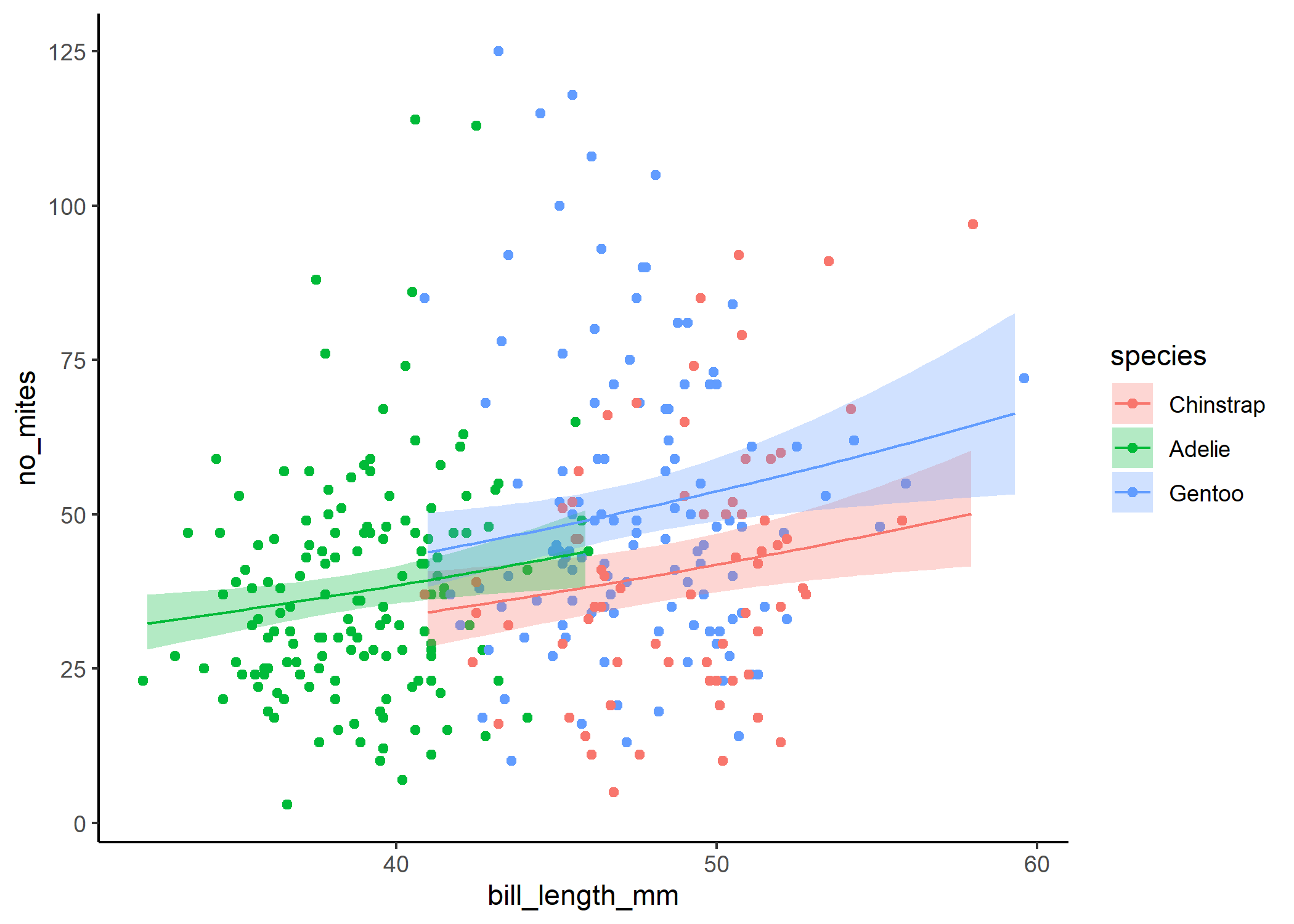
And finally, we can use ggpredict to see how bill length is related to the number of mites, and separate the trend for each species:
predict_final <- ggpredict(mod_nb2, terms = c("bill_length_stand[n=100]",
                                              "species")) %>%
                        #note that specifying n= in square brackets just
                        #tells ggpredict that you want it to create a
                        #larger df, which can help smooth out the plot
                        #you can also specify a range here instead
                        #(e.g., [10,30])
    #now we'll rename some of these columns so they line up with our original df
    rename(bill_length_stand = x,
           species = group) %>%
    mutate(bill_length_mm =
             bill_length_stand*sd(df$bill_length_mm)+
             mean(df$bill_length_mm)) %>%
  #it's also often a good idea to limit predictions to the real values rather
  #than extrapolating
  filter((species == 'Adelie' &
            (bill_length_stand >=
               min(filter(df, species == 'Adelie')$bill_length_stand) &
               bill_length_stand <=
               max(filter(df, species == 'Adelie')$bill_length_stand))) |
           (species == 'Chinstrap' &
              (bill_length_stand >=
                 min(filter(df, species == 'Chinstrap')$bill_length_stand) &
                 bill_length_stand <=
                 max(filter(df, species == 'Chinstrap')$bill_length_stand))) |
           (species == 'Gentoo' &
              (bill_length_stand >=
                 min(filter(df, species == 'Gentoo')$bill_length_stand) &
                 bill_length_stand <=
                 max(filter(df, species == 'Gentoo')$bill_length_stand))))

ggplot(df, aes(x = bill_length_mm, y = no_mites)) +
  #plot the raw data
  geom_point(aes(colour = species)) +
  #now plot the  model output
  geom_ribbon(data = predict_final,
              aes(y = predicted, ymin = conf.low, ymax = conf.high,
                  fill = species),
              alpha = 0.3) +
  geom_line(data = predict_final,
            aes(y = predicted, colour = species)) +
  theme_classic()
Final thoughts
You did it!! You now have the basics for GLMMs covered. Keep in mind that things can still get a heck of a lot more complicated than this and there are way more things to learn - but you should have all the fundamentals you need to get going now!