Principal Component Analysis (PCA)
Multivariate statistics can sound scary, but in many instances there are ways to reduce the number of variables (i.e., the dimensionality) without losing any of the information between them. These methods are typically referred to as ordination methods because they reduce the dimensionality of your data. You’ll choose an ordination method based on the question that you’re answering and what you’re trying to achieve. In ecology (particularly community ecology), the two most common forms of ordination methods are either a principal component analysis (PCA) or a similarity matrix with non-metric multidimensional scaling (nMDS). PCAs use a Euclidean distance and cannot handle missing values, whereas nMDS can use different distance values (e.g., Bray-Curtis, Jaccard) and can thus handle missing values.
In this tutorial, we’ll focus on using PCAs to reduce the dimensionality of penguin body characteristics (stay tuned for a tutorial on nMDS analyses). There are a ton of resources that will dive deep into the math, but the purpose of this tutorial is to just provide you with the basics of coding and interpreting PCAs. At the end of this tutorial, you will be able to:
- Code and interpret the output of a PCA
- Apply PCA values in seperate analyses (e.g., GLMs)
- Create beautiful PCA ggplot objects
Part 1: Coding and interpretting PCAs
Let’s say we want to know how body characteristics vary with different species of penguins. We’ll be using the palmerpenguin dataset to do this. We’ll also load the ggfortify package in case you just want a quick and dirty PCA plot.
library(tidyverse)
library(palmerpenguins)
library(ggfortify)
So, the first step is to remove any rows with missing values (NAs).
penguins <-
  penguins %>%
  drop_na()

head(penguins)
## # A tibble: 6 x 8
##   species island bill_length_mm bill_depth_mm flipper_length_… body_mass_g
##   <fct>   <fct>           <dbl>         <dbl>            <int>       <int>
## 1 Adelie  Torge…           39.1          18.7              181        3750
## 2 Adelie  Torge…           39.5          17.4              186        3800
## 3 Adelie  Torge…           40.3          18                195        3250
## 4 Adelie  Torge…           36.7          19.3              193        3450
## 5 Adelie  Torge…           39.3          20.6              190        3650
## 6 Adelie  Torge…           38.9          17.8              181        3625
## # … with 2 more variables: sex <fct>, year <int>
str(penguins)
## Classes 'tbl_df', 'tbl' and 'data.frame':    333 obs. of  8 variables:
##  $ species          : Factor w/ 3 levels "Adelie","Chinstrap",..: 1 1 1 1 1 1 1 1 1 1 ...
##  $ island           : Factor w/ 3 levels "Biscoe","Dream",..: 3 3 3 3 3 3 3 3 3 3 ...
##  $ bill_length_mm   : num  39.1 39.5 40.3 36.7 39.3 38.9 39.2 41.1 38.6 34.6 ...
##  $ bill_depth_mm    : num  18.7 17.4 18 19.3 20.6 17.8 19.6 17.6 21.2 21.1 ...
##  $ flipper_length_mm: int  181 186 195 193 190 181 195 182 191 198 ...
##  $ body_mass_g      : int  3750 3800 3250 3450 3650 3625 4675 3200 3800 4400 ...
##  $ sex              : Factor w/ 2 levels "female","male": 2 1 1 1 2 1 2 1 2 2 ...
##  $ year             : int  2007 2007 2007 2007 2007 2007 2007 2007 2007 2007 ...
Let’s say that we’re interested in all the body characteristics in our dataset, but how correlated are they with each other? We need to check this because if they’re too correlated with one-another, then we can’t throw them all into a single model. If the variables that you care about aren’t correlated, then you probably don’t need to continue with this tutorial!
But first, let’s check the correlation:
corr_mat <-
  as.matrix(round(cor(penguins[, c(3:6)]), 2))

# We'll remove the top half of the matrix because it's all just redundant information
corr_mat[upper.tri(corr_mat)] <- NA
corr_mat
##                   bill_length_mm bill_depth_mm flipper_length_mm
## bill_length_mm              1.00            NA                NA
## bill_depth_mm              -0.23          1.00                NA
## flipper_length_mm           0.65         -0.58              1.00
## body_mass_g                 0.59         -0.47              0.87
##                   body_mass_g
## bill_length_mm             NA
## bill_depth_mm              NA
## flipper_length_mm          NA
## body_mass_g                 1
Yikes, so flipper_length_mm and body_mass_g are highly correlated. But you really want to include all these variables because they’re important for your hypotheses! Lucky for you, we can run them in a PCA (yes, that was tacky, but whatever).
When you’re running a PCA, the variables that you are collapsing need to be continuous. If you don’t have all continuous variables, then you’ll need to consider a different ordination method (e.g., Jaccard similarity indices use a binary presence/absence matrix). Similarly to running linear models (and its variations), it’s a good idea to scale and center our variables. Luckily, we can do this inside the prcomp() function.
pca_values <-
  prcomp(penguins[, c(3:6)], center = TRUE, scale = TRUE)

# Let's look at the PCA values
summary(pca_values)
## Importance of components:
##                           PC1    PC2     PC3     PC4
## Standard deviation     1.6569 0.8821 0.60716 0.32846
## Proportion of Variance 0.6863 0.1945 0.09216 0.02697
## Cumulative Proportion  0.6863 0.8809 0.97303 1.00000
The number of principal components will always equal the number of variables you’re collapsing - in our case, we have four (i.e., PC1, PC2, PC3, PC4). The table that is presented is telling you how well the PCA fits your data. Typically, we assess PCA “fit” based on how much of the variance can be explained on a single axis. Here, the proportion of variance on the first axis (PC1) is nearly 70%, which is great! The last row is describing the cumulative proportion, which is just the sum of the proportion of variance explained by each additional axis (the sum of all axes will equal 1.00).
The numbers are great (and you’ll have to report them in your results), but let’s visualize this. For a quick a dirty PCA plot, we can just use the ggfortify::autoplot() function. This produces a ggplot object, so you can still manipulate it quite a bit, but we’ll also provide code below so you can make your own.
autoplot(pca_values, loadings = TRUE, loadings.label = TRUE)
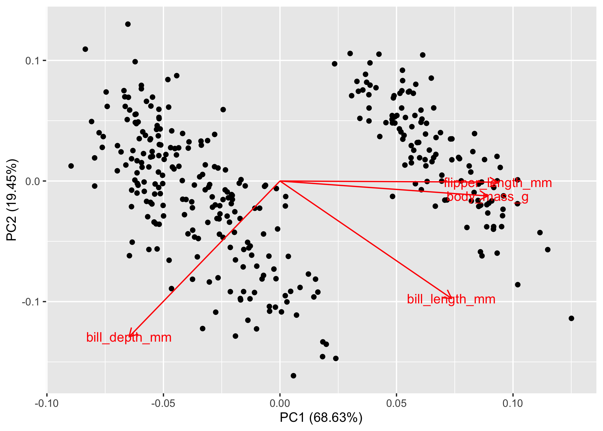
Now, what the fork are we looking at? As promised, we’ll keep the math to a minimum. If you recall from highschool physics or math, the arrows are vectors, which means that they have magnitude and direction. The size of the arrow denotes the magnitude, while the direction denotes, well, the direction. These are the eigenvectors calculated by the fancy PCA math. Note: it defaults to showing PC2 ~ PC1, but you can specify whichever axes you want to look at.
The interpretation is actually quite simple. Variables that have arrows of similar length and direction are more correlated to one another than arrows that are perpendicular to one another. If two arrows are pointing in the exact opposite direction, they’re negatively correlated. You can double-check all this with the handy correlation matrix that we made above, you’ll see that flipper_length_mm and body_mass_g are correlated (r = 0.87) and their arrows are nearly parallel! Sick, but there’s more information here than just correlation.
The direction and magnitude of each arrow is also telling you how much of that variable loads on that axis. Let’s take bill_depth_mm as an example. Here we can see that decreasing values of PC1 equate to larger values of bill_depth_mm because its eigenvector is pointing towards the left side of the plot. We also see a similar pattern with PC2, where decreasing values of PC2 = increasing values of bill_depth_mm. Conversely, increasing values of PC1 would equate to increasing values of flipper_length_mm, body_mass_g, and bill_length_mm.
Finally, because we’re in non-dimensional space, the clustering of points matters as well. Points that are clustering near each other are more similar than those that are further apart. This is easily visualized if we colour the points; as an example, we’ll colour the points by species.
autoplot(pca_values, loadings = TRUE, loadings.label = TRUE,
         data = penguins, colour = 'species')
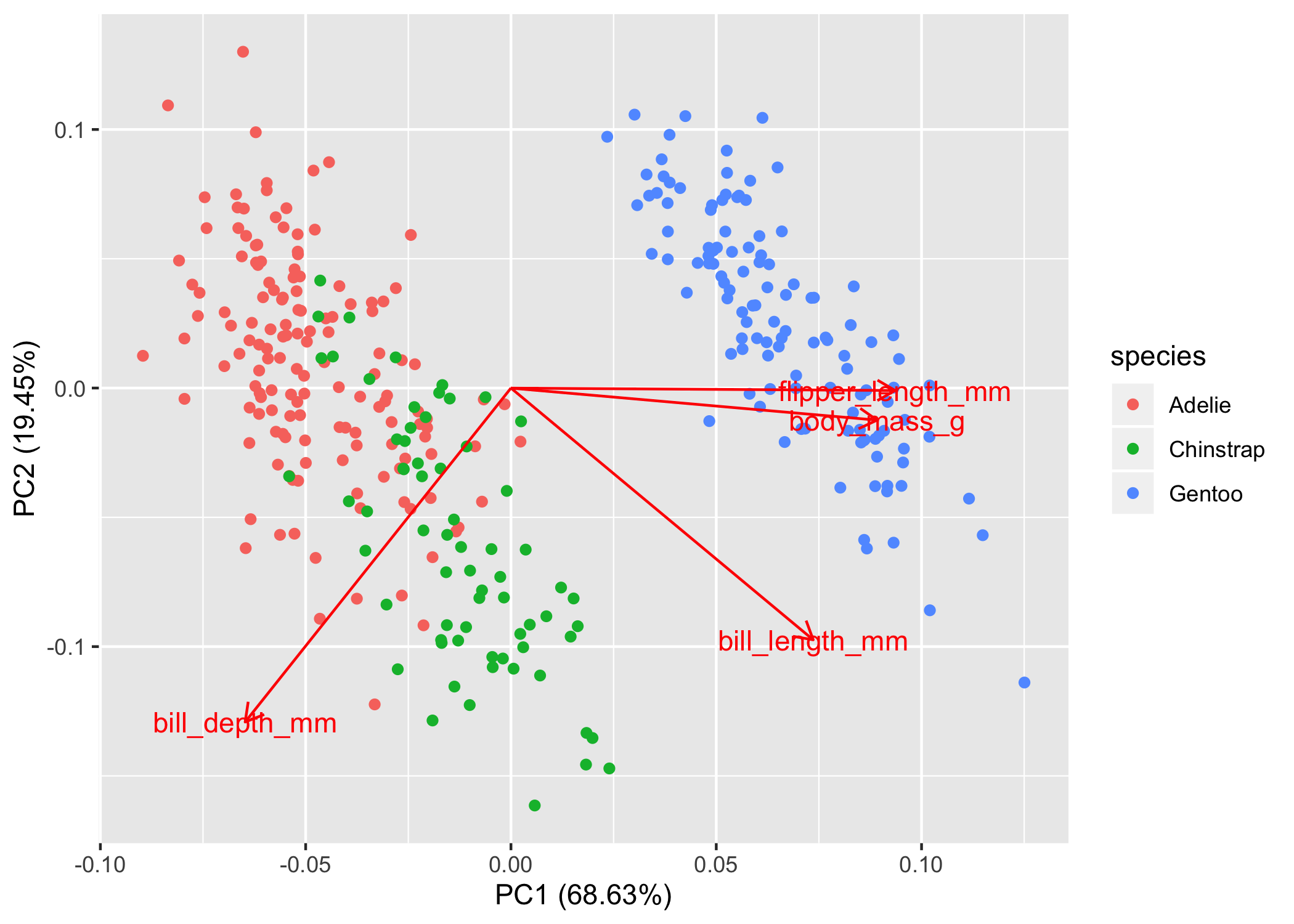
So now we can see that the Adelie and Chinstrap points cluster, but they also overlap quite a bit. In this non-dimensional space, you would interpret them as more similar to one another. The Gentoo penguins are way to the right and don’t overlap with the other two species at all, so we would say that they are very different in terms of bill depth, bill length, flipper length, and body mass. Of course we can see this in the plot, but if you want to test clustering, then we’ll have to do that in a separate analysis.
Click here to see more on ggfortify::autoplot() for PCA plots.
Part 2: Tying PCAs into other analyses
You don’t always need to move forward to analyzing your PCA results separately, in which case you can skip Part 2 and go straight to Part 3. In this section, we’ll cover the basics on how to extract PCA values and then regress them against other independent variables.
In this case, PC1 can act as a composite index of body characteristics. We can see that species are clustering in a certain way, but is this statistically sound? One way to test this is to see if PC1 varies with species. To test this, let’s first extract all the PCA values and combine them with the penguin data. The PCA values are presented in the same order and length as our data, so we can just combine the two dataframes together in a tibble (Note: a tibble acts as a Tidyverse version of a data frame, with some minor differences).
pca_points <-
  # first convert the pca results to a tibble
  as_tibble(pca_values$x) %>%
  # now we'll add the penguins data
  bind_cols(penguins)

head(pca_points)
## # A tibble: 6 x 12
##     PC1     PC2     PC3    PC4 species island bill_length_mm bill_depth_mm
##   <dbl>   <dbl>   <dbl>  <dbl> <fct>   <fct>           <dbl>         <dbl>
## 1 -1.85 -0.0320  0.235   0.528 Adelie  Torge…           39.1          18.7
## 2 -1.31  0.443   0.0274  0.401 Adelie  Torge…           39.5          17.4
## 3 -1.37  0.161  -0.189  -0.528 Adelie  Torge…           40.3          18
## 4 -1.88  0.0123  0.628  -0.472 Adelie  Torge…           36.7          19.3
## 5 -1.92 -0.816   0.700  -0.196 Adelie  Torge…           39.3          20.6
## 6 -1.77  0.366  -0.0284  0.505 Adelie  Torge…           38.9          17.8
## # … with 4 more variables: flipper_length_mm <int>, body_mass_g <int>,
## #   sex <fct>, year <int>
So now we’ve got a dataframe where each row of our data corresponds to a single observation and its associated PC values. So let’s find out if we can explain the variation in PC1 with species
pc1_mod <-
  lm(PC1 ~ species, pca_points)

summary(pc1_mod)
##
## Call:
## lm(formula = PC1 ~ species, data = pca_points)
##
## Residuals:
##     Min      1Q  Median      3Q     Max
## -1.3011 -0.4011 -0.1096  0.4624  1.7714
##
## Coefficients:
##                  Estimate Std. Error t value Pr(>|t|)
## (Intercept)      -1.45753    0.04785  -30.46   <2e-16 ***
## speciesChinstrap  1.06951    0.08488   12.60   <2e-16 ***
## speciesGentoo     3.46748    0.07140   48.56   <2e-16 ***
## ---
## Signif. codes:  0 '***' 0.001 '**' 0.01 '*' 0.05 '.' 0.1 ' ' 1
##
## Residual standard error: 0.5782 on 330 degrees of freedom
## Multiple R-squared:  0.879,  Adjusted R-squared:  0.8782
## F-statistic:  1198 on 2 and 330 DF,  p-value: < 2.2e-16
Although simple, here we can see that there is a large effect of species on the variation in PC1. We won’t plunge too much into these results, if you’re not sure how to interpret the model output, stay tuned for our Model Interpretation tutorial (coming soon).
Part 3: Beautiful, publication worthy PCA plots
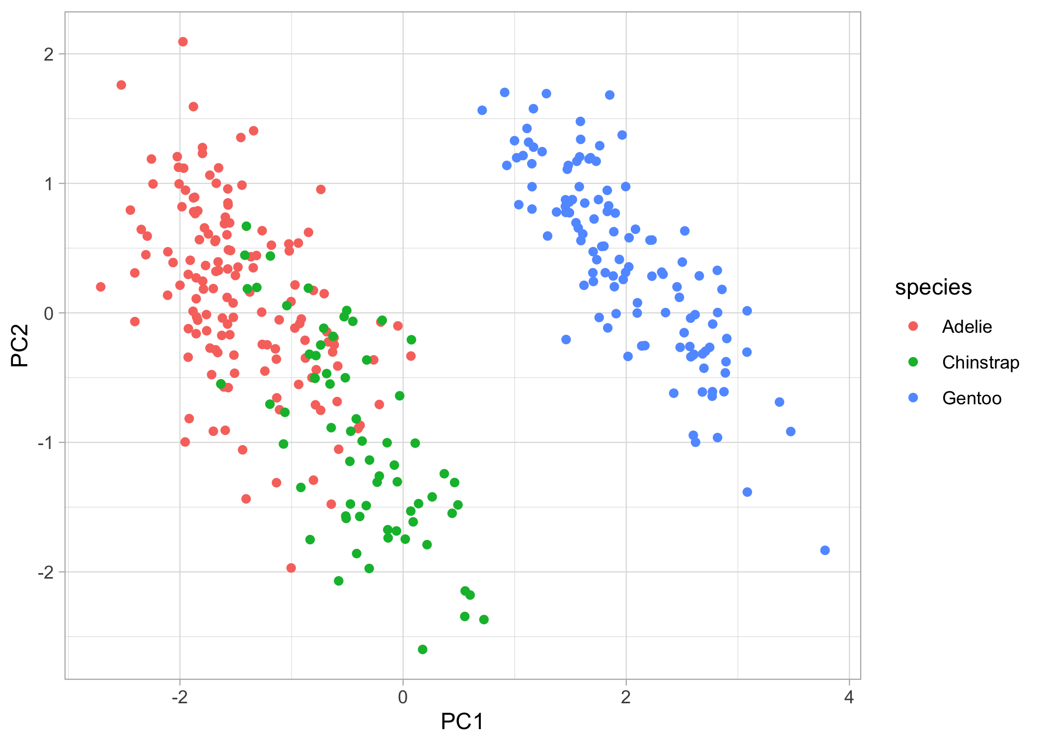
Now for the fun stuff, let’s make some beautiful plots! First, we can just plot the raw points.
basic_plot <-
  ggplot(pca_points, aes(x = PC1, y = PC2)) +
  geom_point(aes(colour = species)) +
  theme_light()

basic_plot
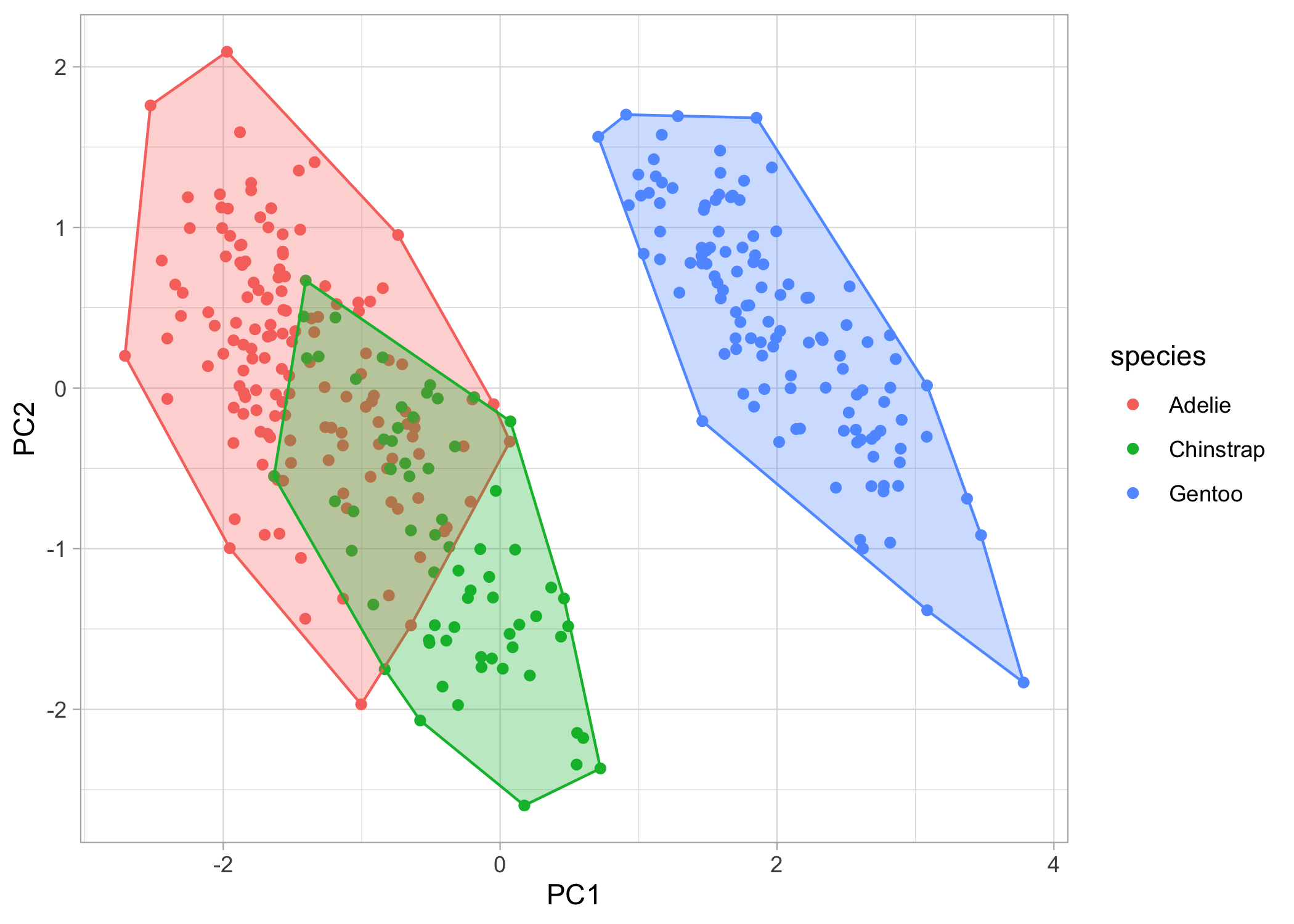
Now, what if we want to also show the clustering of the species? We can add convex hulls to the plots. A convex hull is the smallest polygon that includes all the points of a given level. We’ll have to first create another dataframe where we only include the points that, when connected, will create the polygon. We can automatically calculate this with chull().
# first create a dataframe to extract the convex hull points
pca_hull <-
  pca_points %>%
  group_by(species) %>%
  slice(chull(PC1, PC2))

# now, we'll just continue to build on our ggplot object
chull_plot <-
  basic_plot +
  geom_polygon(data = pca_hull,
               aes(fill = species,
                   colour = species),
               alpha = 0.3,
               show.legend = FALSE)

chull_plot
We’re almost there! Lastly, let’s put the eigenvectors (i.e., the arrows) back on the plot. First, we’ll have to create another dataframe of eigenvectors and then we can throw them back onto the plot
pca_load <-
  as_tibble(pca_values$rotation, rownames = 'variable') %>%
  # we can rename the variables so they look nicer on the figure
  mutate(variable = dplyr::recode(variable,
                                  'bill_length_mm' = 'Bill length',
                                  'bill_depth_mm' = 'Bill depth',
                                  'flipper_length_mm' = 'Flipper length',
                                  'body_mass_g' = 'Body mass'))

head(pca_load)
## # A tibble: 4 x 5
##   variable          PC1      PC2    PC3    PC4
##   <chr>           <dbl>    <dbl>  <dbl>  <dbl>
## 1 Bill length     0.454 -0.600   -0.642  0.145
## 2 Bill depth     -0.399 -0.796    0.426 -0.160
## 3 Flipper length  0.577 -0.00579  0.236 -0.782
## 4 Body mass       0.550 -0.0765   0.592  0.585
You’ll notice that within the geom_segment() function, we’ll multiply the PC values by a constant (in this case by 5). This is because we only care about the relative relationship among the eigenvectors, so the default plot gives you small arrows. By multiplying them by a constant, we can retain the relationships between the loadings while also filling-in the white space on the plot.
For the labels, I’ll be showing you how to do with the annotate() function because I find it gives you more control and flexibility, but you can also use the ggrepel package. I multiply each label by 6 in the x direction and by 5.2 in the y direction to avoid overlapping points.
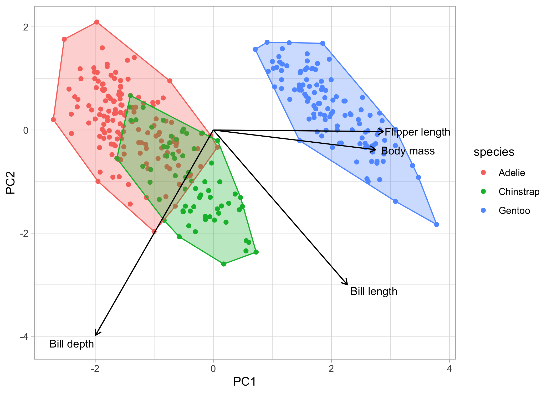
chull_plot +
  geom_segment(data = pca_load,
               aes(x = 0, y = 0,
                   xend = PC1*5,
                   yend = PC2*5),
               arrow = arrow(length = unit(1/2, 'picas'))) +
  annotate('text', x = (pca_load$PC1*6), y = (pca_load$PC2*5.2),
           label = pca_load$variable,
           size = 3.5)
Some final thoughts
Good job, you just did some multivariate analyses (and it wasn’t that scary)! The biggest struggle will be at the very beginning when you have to choose an ordination method. Nine times out of ten, you’ll either be looking at a PCA or an nMDS or sorts. Take the time to refine your hypotheses, the question(s) you’re trying to answer, and the format of your data. Once you really hone-in on these, the rest will fall right into place.
Now, go do science you multivariate rockstar!