Fuck boxplots
Or: How to better display your data
Ok, I will be fully transparent with you all: I hate boxplots. Even more than I hate inappropriately used barplots (at least there are times when barplots really are appropriate, like for counts and proportions!) or pie charts (on rare occasions they make sense!). I would go so far as to say that this isn’t even about personal preference - boxplots are just objectively bad. At best, they obscure information, and at worst, they lead people to draw incorrect conclusions about between-group differences. And this is because they show us a lot of information we don’t generally need to know (like the 25% and 75% quantiles of the data) and almost none of the information we actually need (like the uncertainty around the mean estimate or the raw data themselves).
So in this short tutorial we’re going to cover two main things:
- Why you should hate boxplots too
- How to make much nicer figures that actually show differences between groups
Part 1: Why do boxplots suck?
Let’s start by taking a look at some data to see why boxplots are objectively bad. We’ll use the palmerpenguins package because it’s very fun.
## # A tibble: 6 x 8
##   species island bill_length_mm bill_depth_mm flipper_length_~ body_mass_g sex
##   <fct>   <fct>           <dbl>         <dbl>            <int>       <int> <fct>
## 1 Adelie  Torge~           39.1          18.7              181        3750 male
## 2 Adelie  Torge~           39.5          17.4              186        3800 fema~
## 3 Adelie  Torge~           40.3          18                195        3250 fema~
## 4 Adelie  Torge~           NA            NA                 NA          NA <NA>
## 5 Adelie  Torge~           36.7          19.3              193        3450 fema~
## 6 Adelie  Torge~           39.3          20.6              190        3650 male
## # ... with 1 more variable: year <int>
This dataset gives us a whole bunch of information on different body part for three species of penguins: Adelie, Chinstrap, and Gentoo. As an ecologist, this type of data feels very familiar - we often want to compare differences in certain traits across groups. When plotting this kind of data, people will often use a boxplot:
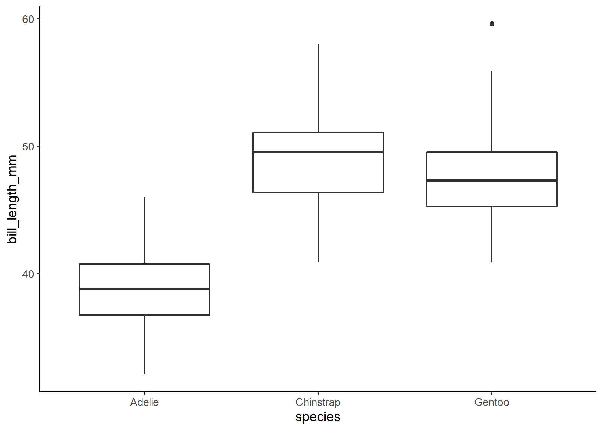
We might then look at that and think that Adelie penguins clearly have much shorter bills than the other two species and that Chinstrap and Gentoo penguins have pretty similar bill lengths since there is so much overlap between the boxes. We can check that with a quick linear model and post-hoc comparison:
mod1 <- lm(bill_length_mm ~ species, data = df)
#to look at pairwise contrasts between all three groups, we can run a post-hoc tukey test using the emmeans package
emm <- emmeans(mod1, pairwise ~ species)
emm$contrast
##  contrast           estimate    SE  df t.ratio p.value
##  Adelie - Chinstrap   -10.04 0.432 339 -23.232  <.0001
##  Adelie - Gentoo       -8.71 0.360 339 -24.237  <.0001
##  Chinstrap - Gentoo     1.33 0.447 339   2.971  0.0089
##
## P value adjustment: tukey method for comparing a family of 3 estimates
Would you look at that: the boxplot lied to us! Our post-hoc analysis tells us that even after correcting for multiple comparisons, there is actually a significant difference in bill lengths between Chinstrap and Gentoo penguins. In this case, the boxplot is actually obscuring our ability to see what’s going on. And that’s not what we want - ideally, when we present people with a figure, we want them to be able to take away the main message from our analysis without having to even read our results! So let’s give that to them.
Part 2: What to do about it
At this point, you may be wondering: what am I supposed to use instead? Well dear reader, do I have the solution for you.
In my (clearly not very humble) opinion, the best thing to present people with is the mean (or median) and our confidence interval (CI) around that estimate. This is far more helpful in allowing us to determine whether groups are really different. Some folks use standard error (SE) instead of confidence intervals around their estimates, and while that’ll certainly pass peer review, to me it just seems like a way of trying to make results look significant (because SE is roughly half of the CI). So let’s stick with the CI.
There are two ways I generally go about doing this. You can either use ggplot’s internal CI plotting function or use a handy package like ggeffects to extract this info to then plot! If you are running just a simple linear model with only one predictor, either way will work fine, but as you move into more complicated generalized and/or mixed effects models, the ggeffects method will be a little easier (and slightly more precise!).
Here is how to do that directly in ggplot:
#note that you'll need the Hmisc package installed for ggplot2 to call on
penguin_plot_default <- ggplot(data = df, aes (x = species, y = bill_length_mm)) +
  stat_summary(geom = "errorbar", fun.data = mean_cl_normal, conf.int=0.95, width = 0.2) +
  stat_summary(geom = "point", fun.y = mean, size = 1.2) +
  theme_classic()
And here’s how to do that with the ggpredict function from the ggeffects package:
sum_stats_gg <- ggpredict(mod1, terms = "species") %>%
  #and then we'll just rename one of the columns so it's easier to plot
  dplyr::rename(species = x,
                mean_bill_length_mm = predicted) %>%
  #you don't have to run this line, but it just removes some of the weird attributes,
  #which makes the table easier to read in this markdown document
  as_tibble()
sum_stats_gg
## # A tibble: 3 x 6
##   species   mean_bill_length_mm std.error conf.low conf.high group
##   <fct>                   <dbl>     <dbl>    <dbl>     <dbl> <fct>
## 1 Adelie                   38.8     0.241     38.3      39.3 1
## 2 Chinstrap                48.8     0.359     48.1      49.5 1
## 3 Gentoo                   47.5     0.267     47.0      48.0 1
penguin_plot <- ggplot() +
  geom_point(data = sum_stats_gg, #set a different dataframe for this layer
             aes(x = species, y = mean_bill_length_mm),
             size = 4) +
  geom_errorbar(data = sum_stats_gg, #set a different dataframe for this layer
                aes(x = species,
                    y = mean_bill_length_mm,
                    #and you can decide which type of error to show here
                    #I think CIs are always better because that's what we
                    #actually use to assess significance
                    #although keep in mind that if you're comparing more than
                    #two levels, our post hoc tests (like Tukey) make an
                    #additional correction for significance that you don't see
                    #in this plot
                    #you can check out the emmeans package for more info on that
                    #type of correction
                    ymin = conf.low,
                    ymax = conf.high),
                width = 0.2,
                size = 1.2) +
  theme_classic() #clean it up a bit
penguin_plot
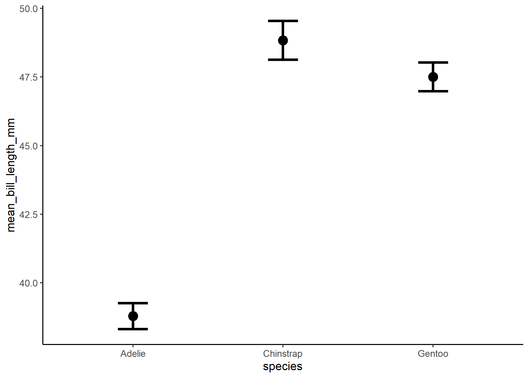
Whichever way you end up using, you end up with a lovely replacement to the boxplot.
And now we can see the significant differences more clearly! The only important thing we’re missing from the original boxplot is some measure of the spread of the data. And in my experience, the best way to show that is by actually just plotting the raw data! This can be a little overwhelming with large data sets, but with the appropriate use of transparency and jittering, this can be a lot more powerful than a boxplot - especially if the data aren’t normally distributed.
penguin_plot +
  geom_jitter(data = df, aes (x = species, y = bill_length_mm),
              alpha = 0.2, height=0)
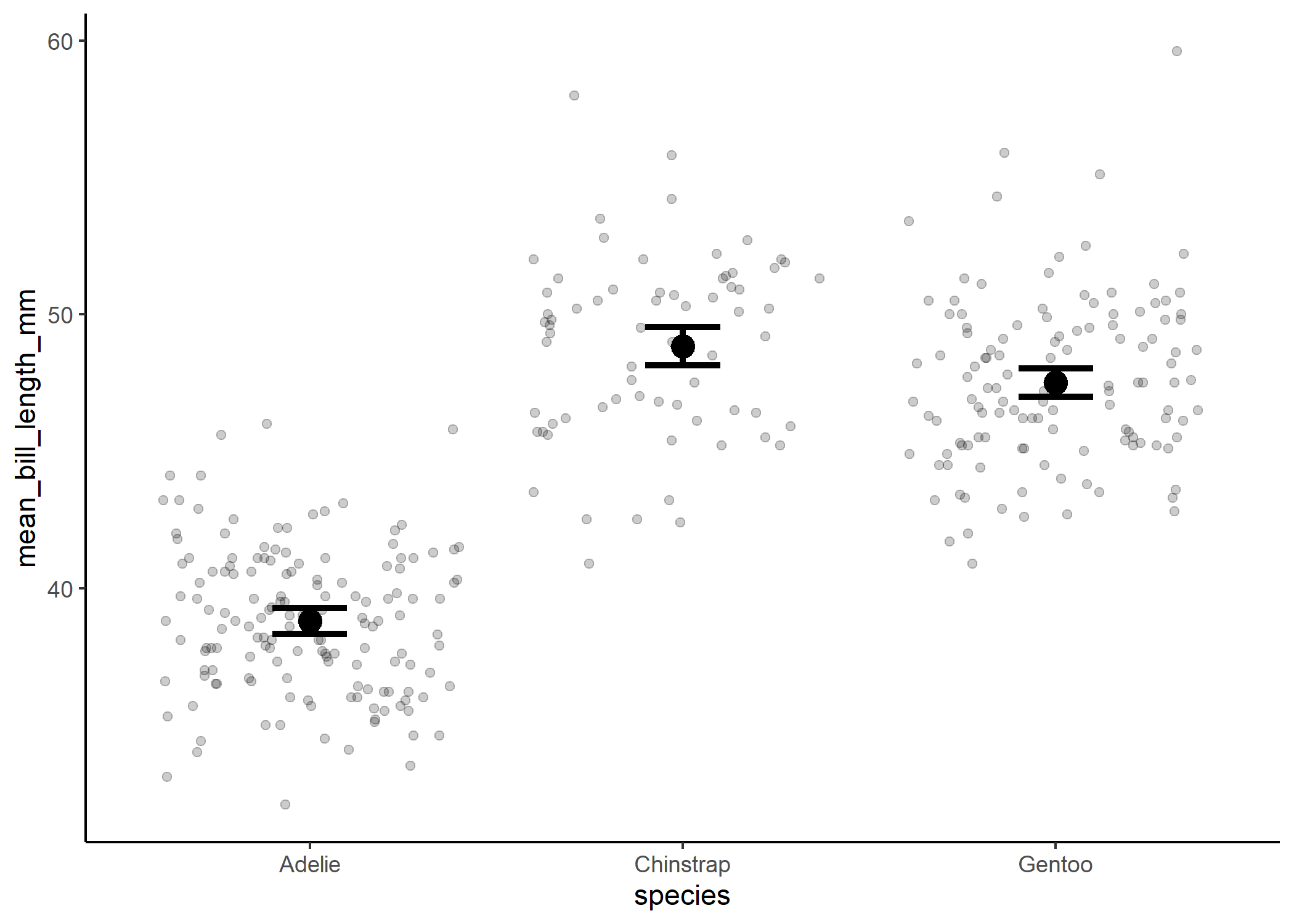
Et voila! Go forth and rid the world of boxplots!